Nicole Aptekar’s New Paper Explorations
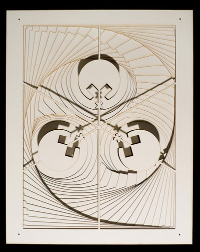
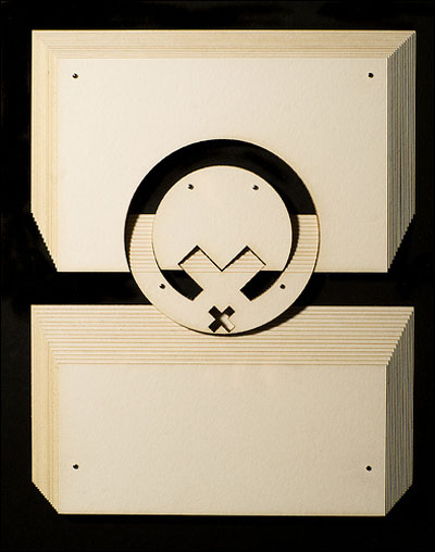
“Don’t look at me that way,” detail.
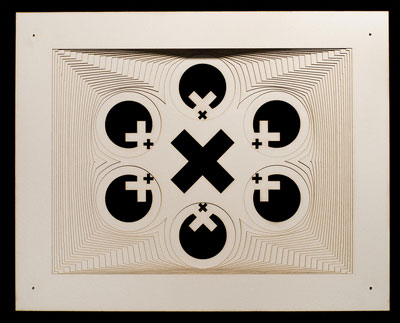
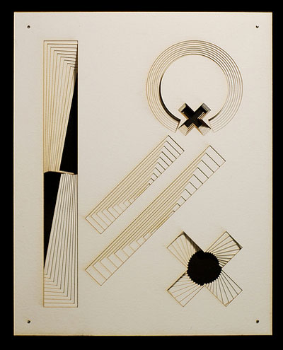
Textured scaffolding made out of paper. Spun cavities, spiraling angles and floating bristol-board islands. A mysterious, solitary logo consisting of circle and the letter X, reinterpreted in dozens of different ways.
Tonight in the Bay Area, artist, photographer and Syzygryd co-designer Nicole Aptekar unveils a series called New / Exploration / Paper at the Satellite66 gallery in SOMA. Coilhouse caught up with Nicole during the hectic last day of gallery preparation to discuss these pieces and the process behind them.

“Play revolver,” detail. Photo by Nicole Aptekar
COILHOUSE: Let’s start with this logo, the circle with the letter “x” positioned inside of it. How long has it been around? What’s the story behind it?
NICOLE APTEKAR: I came up with the symbol in the summer of 2009. I was interested in sticker art, and wanted something to tag with that was not obviously a tag. I was experimenting with a number of different logos. In some versions, the circle was very dominant. In other versions, it was the “x”. The x-heavy versions of the logo were significantly more… vicious? Aggressive? They had no meaning, yet they had this built-in aggression that I found really interesting and kind of desirable, which I thought was curious, since they were just abstract symbols. I started putting stickers of the logo up all over San Francisco and wherever I traveled. It was fascinating to see which ones stayed and which ones didn’t. This version with the double-x is the one that I claimed for myself as a logo. Then I started using it to label things: my laptop, my bike, etc. When I had the opportunity to make it a part of a composition, I took it, instead of just slapping a logo on top of things. One example of that is the “Clear” button on the Syzygryd controller touchscreen… yeah, I tagged my own art.
Conventionally, it’s corporations that have logos, not individual people. So why your own logo?
A big part of it is that I find stickering really fascinating. I’m a big fan of B.N.E. and AERA HAKR. I watch the streets to see all the new sticker people because, for their brief moment, they are prolific. You can’t spray-paint every street, but you can absolutely throw seven stickers down as you’re walking. But I don’t really have the attachment to a name that many in the graffiti community seem to have. Coming up with a fake name and throwing that down is not my thing. I don’t want people to know who I am, I’m not concerned with getting my name out. I’ve always been into graphic design and typography, though. Seeing abstract symbols in the wild engages my curiosity. There’s moment of puzzlement when you see some strange symbol in some random place, like on a trash can. Like, “what could this mean?” I feel like seeing the same logo in different places gives people the opportunity to get curious and find out. With an abstract logo, it’s not necessarily as obvious as with with a name. I feel like that’s more interesting.
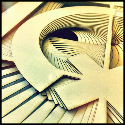
Laser cutter in action. Photo by Nicole Aptekar
How did you transition from making stickers to making these sculptural paper compositions?
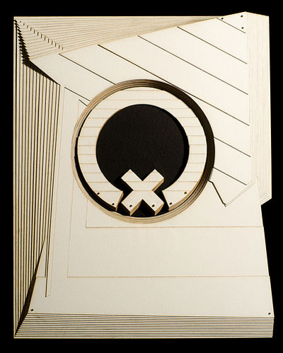
In January, I came across Matt Shlian’s work, and I became really inspired. He made a set called The Process Series, which are blocks of stacked paper that was cut using a plotter. He was taking grids and moving them around, and I thought that was really amazing. I’d been using laser cutter for a year and a half at that point, and I thought I could do something similar with it. So I just booked the laser at Techshop to see if it would be possible to laser-cut a piece similar to ones in The Process Series. Except that, instead of using one of his shapes, I used my logo. So I cut it, glued it together – hated the process of gluing it together – and I came up with this. I liked it, but it was so entirely similar to Shlian’s concept that I was really embarrassed by it. But I didn’t want to give up on it, either. So I started to ask myself: what could I do to feature my logo in a way that exposes the depth and breaks away form the grid structure? Shlian’s thing was repeated grids: squares, triangles, etc. He had his own unique way of pulling through depth, and I wanted to see what the variations are on that. I wanted to see what kind of shapes I could compose from my logo that were definitely mine, and not reminiscent of his. I developed several concepts for how to accomplish this using my own terminology. A projected cavity is large shape swept around to make a smaller shape. A spun cavity is when I take a shape and twist it. Spars and scaffolding are beams attached to the side of the frame that hold up elements that need to float.

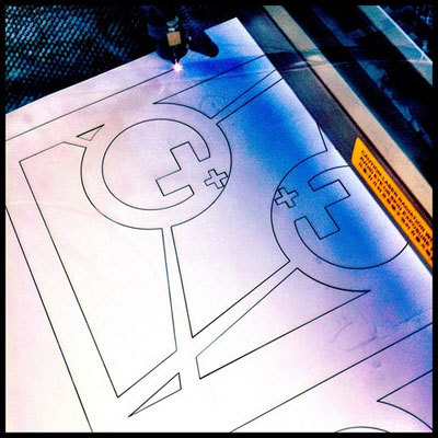
“Don’t look at me that way” before it’s printed and cut, in Rhino 3D.
Can you describe your process for making these?
I start by designing these in CAD using Rhino 3D. In Rhino, none of these pieces are cut – it’s all one solid piece – so it’s hard to predict what kind of interplay all the individual layers will have. By the time I chop them up with the laser and lay out the pieces, I have no idea what it will all look like until it’s assembled. I’m completely unable to work on more than one of these at once. Each one leads directly onto the next; many of these contain new variations on a technique I had just learned while making the previous piece. For example with this one, I developed the notion of having the frame turn into that shape in the center, becoming part of the composition. And then with this one, which I made right after it, I did the same thing but also took that shape and twisted it. The shape of this one is basically secondary to the movement of the bar and its center point. That’s something that I never saw when I was doing it in CAD, but it looked shockingly beautiful to me when I started to put it all together. And then in the next one after that, I also had that frame and that spun cavity, but I added scaffolding at the top. In putting together this exhibition, I’ve learned a ton. Each one of these pieces represents an amount of knowledge I have gained.
One of Nicole Aptekar’s original pieces will be available at the Coilhouse Black & White & Red All Over Ball silent auction in New York this August 21st. See you there!
![]()
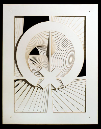
“Don’t look at me that way.” Photo by Audrey Penven.
“Play revolver.” Photo by Audrey Penven.
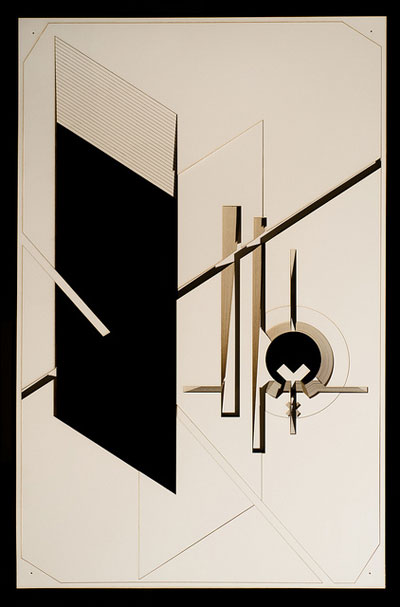
“Thanks László”. Inspired by A IX, by László Moholy-Nagy. Photo by Audrey Penven.
“Centralize.” Photo by Audrey Penven.
“Thoughtful.” Photo by Audrey Penven.
“Plateau.” Photo by Audrey Penven.
“Downslide.” Photo by Audrey Penven.

Nicole lasers flyers for her show. Photo by Nicole Aptekar.
Circle-x logo on a laptop. Photo by Nicole Aptekar
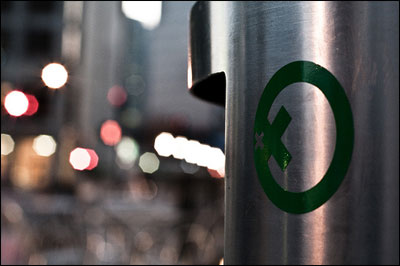
Circle-x logo in the wild. Photo by Nicole Aptekar
August 12th, 2011 at 1:47 am
I really like these. Coverage of this artist was chosen well, given the theme and goal of Coilhouse. Very interesting.
August 12th, 2011 at 8:36 am
Architecture!
August 12th, 2011 at 10:06 am
Yay!! Her work is BEAUTIFUL! And the opening is tonight? I’ll totally stop by, its right by my work!
August 12th, 2011 at 10:44 am
Gooby, yesyesyes! You should come by! I’ll be there starting 7.
August 14th, 2011 at 6:38 am
[…] http://coilhouse.net/2011/08/nicole-aptekars-new-paper-explorations/ […]
August 15th, 2011 at 1:56 pm
I’m so in love with this!
August 15th, 2011 at 8:00 pm
[…] [photo by Nicole Aptekar] […]
August 16th, 2011 at 3:53 am
[…] [photo by Nicole Aptekar] […]
August 16th, 2011 at 10:57 am
Magneto helmet X-Men logo.
August 17th, 2011 at 6:26 pm
[…] paper explorations Artist Nicole Aptekar's paper art creations Coilhouse Blog Archive Nicole Aptekar’s New Paper Explorations […]
August 19th, 2011 at 6:53 am
[…] Coilhouse, images via Nicole Aptekar Tweet This entry was posted in exhibition, illustration […]
August 22nd, 2011 at 12:27 am
[…] un’intervista a Coilhouse, Nicole Aptekar racconta il processo di creazione per queste opere: “Inizio disegnando le […]
November 3rd, 2012 at 5:50 pm
[…] used almost exclusively as a medium of information. Exceptions like Nicole Aptekar’s stunning paper art only serve to prove this rule. This is true even of photo printers: if it can be digitized, […]
November 8th, 2012 at 3:34 am
[…] used almost exclusively as a medium of information. Exceptions like Nicole Aptekar’s stunning paper art only serve to prove this rule. This is true even of photo printers: if it can be digitized, […]