New Coilhouse Website: What Would You Like to See?
Beloved readers!
First off, great news: Issue 06 of Coilhouse has finally gone to print. In just a few short weeks, it will be hitting bookstores and we’ll be unveiling it here on the site. WOOO HOOO. Finally. We’re already laying the groundwork for Issue 7, and a lot of other exciting projects are in the works. You’ll be hearing about all the latest developments in the months to come.
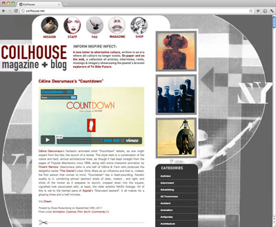
With all this newness happening, one thing has become clear: it’s time for a revamped website. The current version has just passed the four-year mark, and it’s served us well. But a lot has happened to the web in past four years: HTML5, higher screen resolutions, faster internet connections, the decline of Flash. We’d like to craft a beautiful new website that keeps up with the times: one that’s clean, usable, lightweight, and accessible. And for that… we need your input! And so, we’re conducting a brief survey. Please take the time to answer the questions below. You can answer partially, but the more information we have to go on, the better!
- Are there any new features you’d like to see on the site? (Ex. larger images, a search bar, ways to tweet/email/share each post)?
- Do you use the “Categories” section to browse through old posts? Should it remain prominent in the new design?
- Generally, what are some websites and blogs you think have great design?
- For comments: should we stick with WordPress comments, or go with Disqus?
- Any annoying trends we should avoid? Anything you like about this version of the site that we should keep?
September 29th, 2011 at 2:21 pm
Hi,
I’d love to see larger images, and perhaps a wider column for words /images /posts in general. And yes: share-ability might be a nice feature.
I *DO* use the categories section, so yes: please keep it accessible.
PLEASE DON’T GO TO DISQUS!!! I hate disqus.
DON’T follow the trend of having too many recent posts shown on the front page. I don’t care for the cluttered look it creates.
September 29th, 2011 at 2:24 pm
larger images are a good idea, but a search bar would be better.
I personally think the categories section rocks, from both a practical perspective, and from the joy I get from seeing all the wonderful turns of phrase listed down the side.I use it a lot, and I dont think the website would be improved in any way if a list containing links titled things like “End of the World” “cryptohistory” “crackpot visionary” and “silly-looking types” side by side with “DIY” “comics” and “Home Decorating” was removed. the only desing problem with it is that on short articles it dramatically increases the length of the page. perhaps when one clicks through to an article it could be truncated to a “click for more” type thing. Then again perhaps that is a little too much to ask. I apologise if I come off as demanding in this respect, it isnt my intent.
Also, I really like the colour scheme. the colour scheme is nice. please keep it. pretty pleeeeaaasse?
(end brain vomit)
September 29th, 2011 at 2:31 pm
@squadratomagico + @typhonatemybaby Awesome. Larger images (around 600px wide?), search bar and share-ability are all on the list.
@squadratomagico I agree about the “recent posts” thing, I find it annoying and almost always ignore it.
@typhonatemybaby Don’t worry about coming off as too demanding… your feedback was really useful. I know what you mean about short articles and page length. I’ll think about how to solve that in the new design. Oh, and I love the color scheme too! Thank you. :)
Keep the feedback coming, guys!
September 29th, 2011 at 2:57 pm
The Categories Section is great and I use it a lot, too. Please, don’t remove it.
September 29th, 2011 at 3:07 pm
I’ll probably come back when it isn’t nearly 1 AM, but my first thoughts are:
– Keep the colour scheme.
I can’t think of another site that uses the same one and when I think Coilhouse I think ‘mid-gray+dark-gray+dark red’ and vice versa when I think of one of those colours.
I think the font is an important part of the look, too.
– I love the “Categories” section. Love it!
– Please keep the load time as is it now.
I have a fast connection, but a lot of sites are… problematic from time to time. It’s not the lag of slow connections, it’s something else.
I could always count on Coilhouse on fully loading. Every. Single. Time.
*
– I do associate relatively smaller fonts and images with Coilhouse, but even on my small laptop screen, the site covers just 1/2 of it.
– Please don’t go too ‘clean’.
– I’m torn about suggesting the ‘similiar posts’ widget.
I went through the archives and I know there’s amazing stuff. It would be a shame if new visitors don’t see it, but… that widget always had something that bugged me. I can’t put my finger on it.
– The featured posts on in the corner haven’t changed since I discovered this site in 2009 or 2010.
– I love it that the selected text doesn’t have a gray background, but the colour that indicates what is selected isn’t visible enough.
Okay, this ended up being quite a bit longer than I had expected O.o .
September 29th, 2011 at 3:55 pm
-I would request keeping the color scheme and the “Categories.” I find them both cool.
-I do think larger images would be nice (the font is fine). While I do love the current style of the site, it only covers about 2/3 of my laptop’s screen while the right section is just the gray background.
-I would prefer if you stuck with WordPress.
– I also do like the idea of just having part of the article and a “click for more” link – though since I usually find out about a new article from the Twitter feed it just brings me straight to the article anyway.
While I only discovered Coilhouse earlier this year and I don’t think I’ve ever actually commented, I love coming here to check out the interesting stuff that you people post.
September 29th, 2011 at 4:39 pm
the categories section is one of my favorite parts of the site, every post, I check the bottom to see what clever tag it deserved. Though, I do think they should be cleaned up and condensed a little.
I’d love a share button!
I’m not a web designer, but I don’t like how the background image just stop midway when you scroll down, maybe like a footer to extend the motif…or..or, I don’t know! Like I said, I’m no designer…
Also, the featured posts never seem to update.
September 29th, 2011 at 5:36 pm
yes, share buttons would be great, and I agree with basically everything else said.
It might be nice to have a “click here for more” button that extends the article within the page, so you don’t have to click back for other posts. I think pitchfork’s website does that, or at least thats the one that comes to mind.
Maybe adding month/year search options as well, or something to make it easier for newer fans to wander the back log.
Also perhaps add everyone’s social media ventures like twitter and tumblr on the Staff page.
But generally, if it ain’t broke, don’t fix it.
September 29th, 2011 at 5:41 pm
I love the categories section and use it often, though I do think they could be cleaned up an reorganized a bit (perhaps use tags and categories?).
I would love to be able to search by monthly and yearly archives as well. There are a lot of posts I have looked for from a few years ago and it would have been easier if there was an archive option.
Larger images would be awesome. Stick with wordpress comments. Add social network sharing options and link to the Coilhouse profiles on different social networks.
September 29th, 2011 at 5:42 pm
I also think that adding a Link Within widget or other similar “related posts” plugin to the bottom of each post that links to other related or interesting articles would be good for newer readers. I find that those plugins help people stay on my blog far longer than normal.
September 29th, 2011 at 7:46 pm
The only thing I would add would be the search bar and the ability to Share-Via-Twitter, from within a post.
WordPress works just fine.
September 29th, 2011 at 8:36 pm
As long as the excellent content stays the same, I’m pretty happy.
September 29th, 2011 at 9:06 pm
A search bar would be great, and definitely keep the categories. Sometimes I like to go back and look at certain things using the categories.
Please don’t switch to Disqus! It always gives me problems and I’m sure I’m not the only one.
September 30th, 2011 at 1:56 am
I find Discuss often takes a long time to load, and intellectually I’m not keen on logging in via a third-party thing to make a comment.
While I’m all for bigger images, the thing that the Coilhouse blog does best is put the images into context. So many “art” blogs on the internet are just massive images of some arts thing without much information (“they are a self taught photographer in Poland” is not helpful). I find I like the short interviews that have come up on here the best, and having a facility to share them on Twitter would be great.
Personally, I never use the categories section. But I’m only ever coming here via RSS.
September 30th, 2011 at 4:17 am
Question 1: Works well currently. No need to hurl that baby out with the arty bathwater. Personally dont care about the capacity to share or tweet information, its about a niche universe (s) which is good.
Question 2: I do use the categories bar. Its not the prettiest part of the site, so maybe a nice red button on the front page that takes you to the categories to search the archive? (It is an archive, y’know).
Question 3: The simple ones are great.
Question 4: Not bothered about comments. One of the best things about coilhouse is the fact that is curated with a particular sensibility by like-minded ladies (and the odd boy, bless em). So if people like something i dont care, if they dont i dont care either. Obviously if warren ellis decides to chip in with something funny then good, but I would much prefer to read his comics.
Question 5: The site is ace. Lots of great stuff found in the dusty corners of the planet. Just make it nice and clear and simple for getting to all the lovely information.
Funnily enough, I never think music articles work as well in this magazine. Much better on made things and oddities.
Annoying trends? Messy open source democratic tag filled twittered memerubbish.
You know what you are doing. Keep up the good work. Gxx
September 30th, 2011 at 5:02 am
I would like slightly larger text or at least not grey on white. Those of us with less than optimal optical skills find it really hard to read without manually adjusting it. (This isn’t hard to do, but anything extra I have to do on website to make it readable is always slightly annoying).
I do like the categories, but agree they should be cleaned up or limited to how much actually shows on the main page.
September 30th, 2011 at 6:15 am
Search Bar and Larger Images? Yes please
Social Media interaction? Twitter/Tumbler/FaceBook and email link buttons would be a nice way of sharing your articles with others.
Categories Section? maybe not so prominent but definitely keep for archive access.
Comments Box or Disquss? WordPress works well, so I reckon you should keep it.
Features I like about the current layout? I love the masthead logo and the mission, staff, faq, magazine and shop buttons, so I’d be sad if they went, but that’s just me :)
September 30th, 2011 at 10:33 am
– I love the Mission (awww!) and Staff pages.
– Another thumbs up for the Search bar.
– I love that some stories are Click Here For More, but not all of them. It’s annoying when a blog forces you to click through for every little thing after half a sentence.
The suggestion about expanding it within the main page is great, if it can be done as The Nonist’s page (fast and elegant).
– MOAR ROSS ROSENBERG :B
@ Stylze Davis
There is the month/year option available, under the Categories list, when you browse using the Older Entires link :) .
September 30th, 2011 at 11:04 am
THE PEOPLE HAVE SPOKEN!
Larger images. Search bar. Share-ability. Keeping the Categories. No fuckin’ Disqus (whew! I’m glad I asked).
Lots of great feedback… thank you, guys. The Mission, Staff, FAQ, etc. pages will definitely stay, though I think it may be time to dust off our Mission Statement and make it better. :)
Zellain, thanks for the tips on having a “similar articles” thing of some sort. Right now we do that manually, but surely there’s a great plugin out there that can help.
Melissa, I hear ya about the readability. This year, one of my eyes got hurt in a LASIK incident, and it’s been much harder to even for me to use this site. That’s one of the big reasons for this redesign: I want to have a site *I* can use, haha.
Phil: D’AWWWWW!
Everyone: thank you so, so, so much for taking the time to let us know your preferences. This will help us make a better site. We’re gonna get crackin’ on it ASAP!
September 30th, 2011 at 8:09 pm
SEARCH BAR, SEARCH BAR, SEARCH BAR!!!!!!!!!!!!!!!!!
I can’t emphasize that enough!
October 1st, 2011 at 5:01 am
What I like about Coilhouse is that it’s straight to the point. It doesn’t get bogged down and it’s simple to navigate. You guys don’t add stuff just because you can or follow design trends that are just superficial. I would hate to see Coilhouse take design aesthetics from say the thousands of obnoxious style blogs out there. Those seem to revel in their noise, ads, and narcissism to the point their information is secondary to personality. Though if you guys gotta add in SOME ads for revenue to fund the magazine and such…have at it ladies. I’ll even actually click on them :P
While bigger images would be great I’d rather not see it turn into a tumblr scenario where the images dominate the text. The current sizes seem more than fair really. Maybe a case by case basis depending on the context or needs of the post?
I like the neutral feel of how each post is presented. Nothing feels more important than the rest or that they are fighting each other for attention. So long as whatever comes next keeps that simplicity and clarity I’ll be a happy reader.
Whatever can be added to make navigating the wealth of posts easier would be appreciated of course. That’s no doubt a tough one.
October 2nd, 2011 at 9:22 am
new features – A search bar would definitely be incredibly helpful. I can’t tell you all the times I’ve wanted to search for something.
You could probably make the column width a bit bigger, too. And maybe a new background image.
Do you use the “Categories” section to browse through old posts? Should it remain prominent in the new design? – Yes.
For comments: should we stick with WordPress comments, or go with Disqus? – I think staying with WordPress would be fine.
Any annoying trends we should avoid? – Giant headers, overly-complex navigation. It should be as easy as possible to access what information you want instead of looking pretentiously busy.
Anything you like about this version of the site that we should keep? – I think the tabs at the top (“Mission,” “Staff,” etc.) are just right. And I like the post suggestions at the side.
October 2nd, 2011 at 9:58 am
Love the categories. Love the color scheme. Love the site as is. Seriously. Thanks for all you do!
October 2nd, 2011 at 5:30 pm
Do you use the “Categories” section to browse through old posts? Should it remain prominent in the new design?
Yes please! I do use it quite often to find an older post or to just browse. I would miss it if it were gone!
October 4th, 2011 at 7:58 pm
I really don’t have much to add to what has already been said. Your blog is already gorgeous to begin with. I’m PSYCHED to see that we’re getting a search bar and options to share articles.
Please don’t fiddle around with the color scheme. How would you feel about adding buttons linking to Coilhouse’s Twitter, Facebook, etc pages? I like how Street Anatomy did theirs (…also an example of another well designed blog): http://streetanatomy.com/