When Lace Becomes Skin: The Serge Lutens Mystique
Please welcome two new guest bloggers to Coilhouse this week! Tomorrow, we have S. Elizabeth (who you may know as ghoulnexdoor on Tumblr) joining us for a fascinating look at Jane Quiet, Occult Detective. And today, we’re premiering a post from decadent fashion designer and long-time friend of Coilhouse, Kambriel. In addition to our two new guests, you will soon be treated to an account of San Francisco’s Edwardian Ball by Neil Girling, last seen on Coilhouse covering the Great Handcar Regatta of ’09. Without further ado, I give you Kambriel! – Nadya
“Beauty is the moment when you raise your head” – Serge Lutens
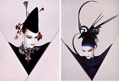
If there was one person who almost mystically inhabited the stylistic world of my own dream-mind starting in the mid-late ’80s, it would be the seemingly not-of-this-world French visionary, Serge Lutens. If you remember the eye-catchingly surreal and over-the-top, yet starkly minimalist graphics he created for Shiseido cosmetics in that era, they embodied a fantastical mystery taken to the extreme ideal. Sometime around 1989, Serge partnered with Shiseido to develop an eyeshadow trio entitled “Black Variations”. Packaged in a Zen-like, sleek black case, it was comprised of three shades. The colours in question? Black, black, and… black! The set was said to be inspired by lava – something that’s often inspired me in my own design work as well, with its ever-changing play of light, contrasting the depth of ultra-matte and sultry shimmering highlights – all translated into a language of divine and utter blackness.

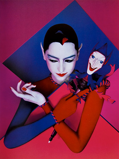
Wizard of variations in black, Serge Lutens also is a master of conjuring extremes in vivid hues of whimsy, creating a world inhabited by willowy court jesters descended to visit us awhile from another universe:

For those with a spare $400-$600 burning a hole in your velvet-lined pocket, an oversized coffee table book of Serge’s photographic, surrealistic splendor is available here.
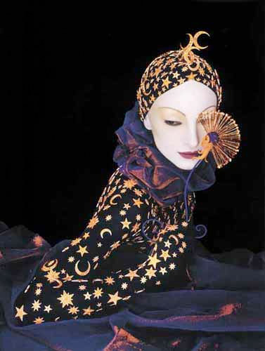
More images by Lutens, after the cut.


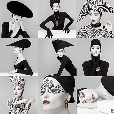
[01/28/10 Addendum: The above is actually not a Lutens piece, just something inspired by Lutens. My bad. – Nadya]


January 28th, 2010 at 1:52 am
Um, the third photo after the cut, containing multiple pictures, is not Luten’s work! It’s from a plagiarist…
January 28th, 2010 at 3:51 am
The design aesthetic is great even today. It doesn’t have the dated qualities of much from the era and it’s not hard to see the influence his work still holds. Well beyond just fashion & photography.
It took me quite a while to appreciate his work though. Fashion photography like this (no matter how great) and its close connection to advertising makes an impact at first but then starts to gel together into a blur. The art of it eventually gets buried under in its commercial needs.
It’s less the case now thanks to all the books, sites, and endless tumblr accounts that highlight the creativity of such work. It really allows one to see this without the weight of a brand or designer crushing it.
Yet sometimes visionaries like this still get lost in the noise. It’s a shame that the best collection of his work is out of print. Hope Taschen puts something together one day.
@Sophie …It’s an “homage” therefore not plagiarism. That makes it ok right? Hehe. Of the little I read about those images one gets the impression those responsible did it on purpose to mimic the style not actually pass it off as original. I could be way off of course…either way I kinda dig what they did. It’s like a really good karaoke singer covering your favorite song.
January 28th, 2010 at 11:40 am
Ooo, it’s like New Romantic meets Bauhaus! I wonder if his work inspired the aesthetic of the movie Liquid Sky?
January 28th, 2010 at 2:44 pm
@Tequila Agreed. But in the article they are credited as Lutens’s, which irks me a bit. They lack his sublte touch and in the same time don’t look artificial enough.
January 28th, 2010 at 3:14 pm
Sorry everyone! Some of these photos were added to the blog after I submitted my piece, and somehow one slipped in that is obviously not the work of Serge Lutens (I agree, you can immediately see the difference as the “homage” piece comes across as being more ~flat~). I’ll be contacting Coilhouse to make sure this is remedied ASAP.
January 28th, 2010 at 4:04 pm
Hey Sophie, Kambriel! I added the image, and I’m actually 90% sure that it’s Lutens. Will do some research…
January 28th, 2010 at 4:09 pm
WHOOPS! You guys are right:
http://frockwriter.blogspot.com/2008/12/are-you-being-serged-patrizio-di-renzos.html
RESEARCH FAIL on my end! There was another one that almost made it into this post before I realized it was an homage, “Lutens’ Punks” by GLWOOD:
More here: http://www.twistedlamb.com/2010/01/new-in-black-book.html
January 29th, 2010 at 10:22 pm
Welcome, Kambriel! Perfect first post. Graceful flutter, lean fluid lines, shiny metal, sharp objects, high contrast color. Perfect.
We all have a faux pas from time to time, not to worry.