Stimulating Juxtapostions: The Art of John Coulthart
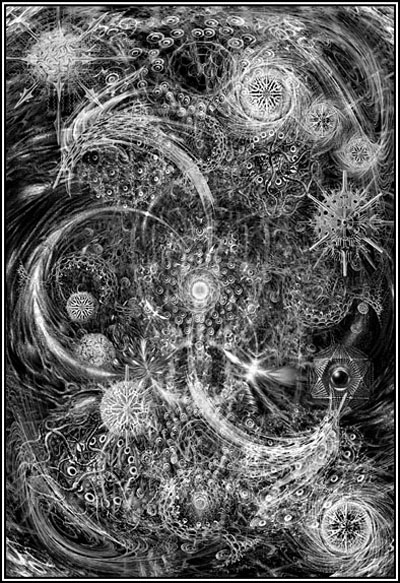
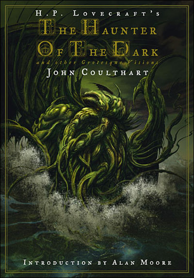
Yog-Sothoth, from The Haunter of the Dark
Discerning seekers of rare or obscure artists will eventually stumble upon John Coulthart’s Feuilleton at some point in their virtual journeys. An artist himself, and a blogger “of some repute”, his site is a veritable Holy Grail treasure collection of luminous paintings, ornate illustrations & woodcuts, and salty vintage photographs that run the gamut from fin de siecle European art magazines to antique occult bookplates to queer themed eye candy from a bygone era for which to titillate our salacious modern sensibilities. One with an interest in such things could literally lose hours perusing his archives. It is with the striking of a dazed and dreamy midnight hour, head filled with inspiration and amazing discoveries, that one realizes where the time has gone.
John is perhaps best known for his own striking and complex “genre-defying” artistry; working with various styles and media in his singular, chimeric aesthetic, he is a successful graphic designer for a variety of mediums including album covers, book covers comic books and graphic novels.
“As a comic artist John produced the Lord Horror series Reverbstorm with David Britton for Savoy Books, and received the dubious accolade of having an earlier Savoy title, Hard Core Horror 5, declared obscene in a British court of law. … His collection of HP Lovecraft adaptations and illustrations, The Haunter of the Dark and Other Grotesque Visions, was republished in 2006 by Creation Oneiros.
As a book designer and illustrator John continues to work for Savoy Books, and in 2003 designed the acclaimed Thackery T Lambshead Pocket Guide to Eccentric and Discredited Diseases edited by Jeff VanderMeer and Mark Roberts.
John’s work has been showcased via Rapid Eye, Critical Vision, Clive Barker’s A-Z of Horror, EsoTerra, CNN.com and the Channel 4 television series Banned in the UK.”
See below the cut for a Q&A in which John discusses fleeting fascinations, enduring enthusiasms, how the mystical and macabre manifests itself in his projects, and the mercurial nature of design.
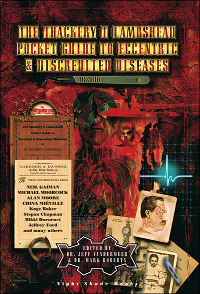
The Thackery T Lambshead Pocket Guide to Eccentric and Discredited Diseases
COILHOUSE: Both the mention in your website bio, and the description in your personal blog, Feuilleton, refers to your cataloging of “interests, obsessions and passing enthusiasms.” What might those encompass right now?
JOHN COULTHART : I watched Visconti’s film Ludwig (about King Ludwig II of Bavaria) recently and was following up that viewing with some web research into his eccentric life. I usually disapprove of monarchs, especially our own dismal royals, but Ludwig is a fascinating and ultimately tragic character. A few months ago I ordered a lot of out-of-print books by the French writer and illustrator Philippe Jullian who wrote one of my absolute cult books, Dreamers of Decadence, a major study of Symbolist painting first published in English in 1971. Jullian was also something of an eccentric who wrote a number of biographies and art books, produced many Ronald Searle-like illustrations and also penned a few novels. Both Ludwig II and Jullian were homosexual and queer culture is an abiding fascination, not least because much of it prior to the 1960s remains little-known or discussed.
I find I spend a lot of time at the moment trawling library sites for interesting pictures. Many of the world’s important libraries now have browsable archives which give access to rare books and magazines. The best of the discoveries recently was the magazine archive at Heidelberg University which has scans of the early issues of Jugend and the entire run of Pan, two German periodicals which did much to promulgate the Art Nouveau style.
Blogging has turned out to be useful for the way it makes you realise you were more interested in something than you previously suspected. When that happens it can provide an element which may feed back into your work. An example of this occurred when I started collecting pictures from different sources and eras; I hadn’t noticed before that the peacock as a symbol connects three areas of interest: medieval alchemy (where its feathers represent a process of iridescence), fin de siècle art, and poster art of the psychedelic era which recycled many 19th century motifs. That’s probably a good example of a passing enthusiasm turning into an obsession.
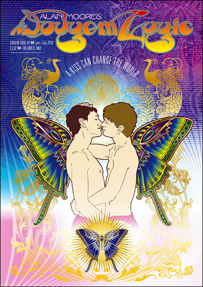
Dodgem Logic #4
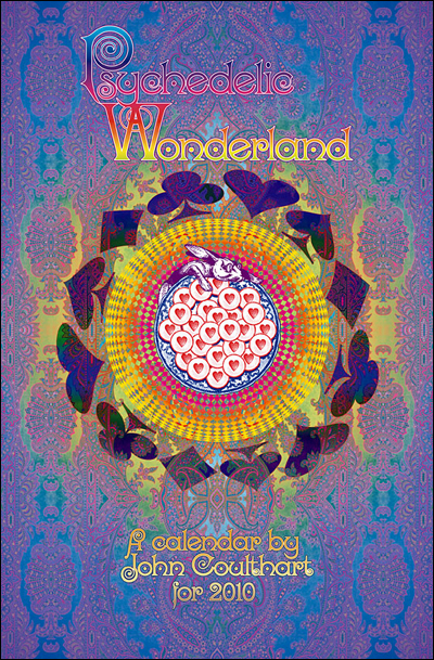
Psychedelic Wonderland
How often do these themes will their way into the projects that you are working on? Or do you try to “live in a bubble” while you are working on a piece? For example both your artwork for Alan Moore’s Dodgem Logic Issue #4 and 2010 Psychedelic Wonderland Calendar (which, by the way, I would love to see somehow expanded into a tarot deck) are possessed of a trippy, hallucinogenic brilliance – was that due in part to a “passing enthusiasm”, or just well, part of the specs for the project?
Well the peacocks were a good example of the enthusiasm affecting the work as I put a lot of peacocks on the Dodgem Logic cover. But generally it depends on the work at hand how much of your own interests feed it. As well as illustrative commissions I’m also employed a lot as a graphic designer and very often the brief for design projects is a strict one with no room required for deviation. In that case you just concentrate on working within the limits.
The calendar came about after I’d spent a summer listening to the British end of the psychedelic music produced in the late 60s. Everyone knows Jefferson Airplane’s White Rabbit is based on the Alice books but so too were a large number of obscure UK songs from around the same time. There’s an enormous amount of Alice-derived illustration out there but I hadn’t seen anyone take quite this approach visually. When a story has been worked over so many times it becomes a challenge to do something distinctive with it, in illustration terms it’s like adapting Shakespeare for the stage. So in this case it was an enthusiasm for the music which became the key to doing something visually. I’m still intending on making the calendar pages into a poster series when I find the time.
The Dodgem Logic cover came along when Alan Moore asked me to do something psychedelic in style for their summer issue. Aside from that vague description I had free reign. Butterflies were the other theme there. If I’d have had more time I maybe would have put some peacock butterflies into the design as well.
There is undoubtedly a vein of the weird and fantastical that runs throughout all of your projects. I am thinking of the Lovecraftian inspired The Haunter of the Dark book in particular, but it seems that great deal of your book cover art falls into the fantasy/horror genre…and then, there is of course, the work that you have done with Alan Moore. Did you start out looking for these types of projects? Or did they just somehow find you? Where does this attraction to the bizarre and lurid stem from? Have you always felt an affinity to the outré and uncanny? Or have your preferences and your style evolved to keep up with what’s required from your art?
I’ve always been interested in the fantastical and grotesque so it’s inevitable this will manifest in the work I produce. It’s never been an indiscriminate interest, however, I always seem to have been very choosy and opinionated. This goes back to an early age. When I was 10 I was reading a lot of Victorian ghost stories in Puffin Books reprints and I quickly became used to a 19th century prose style. A year later I was reading through HG Wells collected short stories and The War of the Worlds. When I started picking up later science fiction novels many of them I found impossible to read on account of what I snootily perceived as poor writing. Arthur C Clarke was fine but many of his “classic” contemporaries I found shockingly bad. It was a relief to find the so-called New Wave sf writers who were trying to do something more with the medium than create futuristic engineering manuals. More than anything I seem to like hybrid works, anything that mixes genres or styles in an interesting or surprising manner. Borders are where new styles emerge and the most stimulating juxtapositions take place. Where these core interests come from I couldn’t possibly say; they’re obviously innate but not something shared by anyone else in my family.
My work often seems to evolve to a certain point then I switch course in a new direction, mostly when I feel I’ve explored one area thoroughly. I spent most of the 1990s doing a lot of very dense, very dark black-and-white line drawing, a lot of which is so extreme in terms of content it became very difficult to push any further. The recent psychedelic-oriented work goes in an opposite direction and it’s one I’m liable to continue for a while since I feel there’s more to be explored in that area. It’s not a case of rejecting one style for another, it’s more that these are equal poles of interest that just happen to be diametrically opposed. This mercurial approach is probably a bad idea when you’re trying to cultivate an audience, people tend to prefer that you do the same thing indefinitely.
Illustration and graphic arts appears to be your primary medium, although I understand you do some writing as well. Are there any areas of artistic expression in which you wish to dabble or to dive?
On the writing front, I have thirty or so films reviews and a couple of essays in ‘Horror!: 333 Films to Scare you to Death’ which Carlton Books are publishing this September. I’ve been writing stories and the beginnings of novels since I was a teenager, and much of that early work was done with greater seriousness than any of the drawing or painting I was doing at the time. The drawing and painting came to the fore when I started to get my work in print but if I didn’t have that additional creative outlet I would have concentrated fully on writing. I’ve gone back to writing fiction as a means of mapping out a new area of personal work which can evolve in several directions, including art and design.
This goes back ten years to when The Haunter of the Dark was published and I felt a line had been drawn (so to speak) under that phase of horror illustration. At the same time I’d finished the Lord Horror comic series I was creating with David Britton and wanted to start something original that was also completely my own. That intention has evolved into a long-term project which now comprises one-and-a-half novels and also an idea for a third book which will combine writing, graphic design and illustration in a manner that I’ve barely begun to consider for the moment. One of the inspirations for this was the Obscure Cities created by artist François Schuiten and writer Benoît Peeters, a multi-media creation which ranges across many books and comic strips (and which, I should note, remains criminally underrated in the English-speaking world). I’ve been crafting an imaginary world of my own where I can do anything I wanted in any medium. For the moment the written fiction is charting the territory, and I don’t want to illustrate this too much–the words are the illustration–but it’s a very open project into which anything I do in the future could easily be integrated. Few people are aware that all the blogging I’ve been doing for the past four years is (among other things) the R&D area of this project, the place where I can follow areas of interest and bookmark things which may feed into something later.
Filmmaking used to be an attraction and I have done a couple of things in that direction, mostly abstract stuff like a 45-minute accompaniment for one of Alan Moore’s readings in 2001. I have a friend who’s directed a feature-length documentary and a number of shorts and I’ve seen how difficult he finds it chasing finance all the time. One of the things I like about creating books is that they’re relatively cheap to produce and you consequently have far more control over the end result.
What are your ideal/dream/pie-in-the sky collaborations? What are some future projects coming up on the horizon that you are excited to be a part of?
One of the reasons I forced myself to address my own work again was because I’d grown tired of collaborations! I’ve been very fortunate to work with the people I have, and collaborations have the value of creating that synergy that William Burroughs and Brion Gysin called “the Third Mind”, something that’s beyond the work either of you might create on your own. But I felt I’d done rather a lot of that and needed to concentrate more fully on my own ideas. Just now I’ll be happy if I can finish the long and ambitious novel I’m writing which has been in progress for the past four years. I have an agent touting the first novel at the moment so I’m obviously keen to see that published.
Coming up there’s a lot of steampunk-related things due to appear. I’ve contributed to The Steampunk Bible, a big glossy guide which Selena Chambers and Jeff VanderMeer have put together for Abrams; I’m currently finishing the design for Steampunk Reloaded, a fiction anthology from Tachyon edited by Ann and Jeff VanderMeer, and I also have some steampunk cover designs on the go. Further down the line there’s another VanderMeer project, The Thackery T. Lambshead Cabinet of Curiosities, which I’ll be helping illustrate. I’m still on board for the guide to the occult arts which Alan Moore and Steve Moore (no relation) have been writing. And in the next month or so I’ll be doing another Alice calendar, based on Through the Looking-Glass this time. This last one I’m looking forward to a great deal.

John Coulthart

October 12th, 2010 at 4:04 pm
What a fascinating interview–I love it when people have a myriad of obscure interests!
October 12th, 2010 at 5:29 pm
Great, great, GREAT Coulthart interview! Thank you!
October 13th, 2010 at 12:44 am
The guy’s a star. Feuilleton is one of the most consistently excellent blogs on the net. Can’t wait for his fiction!