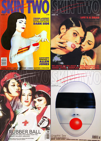
In addition to the many magazines we’ve already mentioned, one of the biggest influences on Coilhouse was Skin Two, the legendary UK fetish mag that’s been around since 1984. Skin Two and the print version of Coilhouse actually share quite a few contributors. David Hindley, who shot the “All Yesterday’s Parties” story in Issue 01, also shot the cover of SK2’s Issue 42 (see below, bottom left). And Nelly Recchia, who appeared in Issue 01’s “People as Pets,” is actually an artist I first discovered in SK2 Issue 51. Other SK2 alums found in Coilhouse Issue 01 include Scar, Atsuko Kudo and Mother of London. Issue 01’s inside cover, conceived by Mildred, was a direct nod to Skin Two’s influence.
And now, the undeniable truth is out: Skin Two is folding. Everyone who’s been following the mag saw this coming from a mile away. Since Skin Two hasn’t brought itself to make a formal announcement, here’s their former editor, Tony Mitchell, spilling the beans (perhaps with a bit of glee) on his blog:
Skin Two magazine is ceasing publication. Information posted on the skintwo.com website states that a new product, the Skin Two Yearbook, is taking over from the legendary fetish journal. Speculation about the impending demise of the magazine was sparked two weeks ago by an e-mail revealing that Liz Tray, its only full-time employee, was leaving the company. Something about the low-key style of this announcement suggested that a bigger story might be about to break. Then, at the end of October, it became evident that all references to advertising in Skin Two magazine had been removed from the Skin Two website. The ‘advertising’ link from the main navigation menu leads to a page that lists all the Skin Two products in which advertising can be bought — and Skin Two magazine is no longer on that list.
Will the current issue 59 be the last, or will the mag carry on to notch up a full 60 editions — or more — before closing? And when will the first Yearbook actually appear? In familiar Skin Two style, no publication date has been given, though blurb on the website refers to it as if it is already in print.
Skin Two was the first truly alt magazine I ever stumbled on, at age 13 (for the fashion, at first), and it inspired me in ways I can’t even count. I still get inspired for Coilhouse, looking at my stack of old Skin Two’s. Having eventually worked with Skin Two, I got to experience the best and worst of it. At its best, this magazine was beautiful, subversive, sexy and strange. At its worst, it was sleazy, tacky and boring. What killed Skin Two? Could anything have saved it? A completely arbitrary, incomplete, biased and NSFW history of Skin Two (with pictures of my favorite and not-so-favorite covers!), after the jump.
In the late 60s and eary 70s, the Rankin/Bass production company made a slew of endearingly hokey holiday-themed “Animagic” flicks that I’m just barely old enough to remember watching in early reruns. I couldn’t have been older than seven or eight when the popularity of such saccharine-injected TV specials as Rudolph the Red Nosed Reindeer and The Year Without A Santa Claus had begun to wane. While I’m too sentimental to harsh on any of that star-studded, sticky-sweet fare, only one of their films has really stuck with me all these years later. Tellingly, that movie is Rankin/Bass’s Halloween special, Mad Monster Party, and it’s all MAD Magazine‘s fault.
Classic Mad Monster Party illustration by Frank Frazetta.
Let’s talk for one sec about MAD. Who here read it growing up? Who still does? If you did/do, I bet it’s high on the What Made You Weird list. Founded in 1952 by editor Harvey Kurtzman and publisher William Gaines, this last gasp of the EC Comics line remained one of the most consistently clever, intelligent, and merciless satirical publications in print until at least the late 90s.* Nothing was sacred and no one was safe. Founded at a time when aggressive censorship and Cold War paranoia muted the voices of activists and humorists alike, the broadly grinning face of MAD’s mascot, Alfred E. Neuman, was a cheerfully innocuous “fuck you” to authority, and has remained so for generations. Honestly, I could rant and rave about the importance of MAD for hours, but it’s Halloweenie time, so I’ll shaddup for now, at least.
So! Mad Monster Party. Kurtzman and longtime MAD cartoonist Jack Davis were very hands on in writing and conceptualizing this island of classic horror movie monsters, and it shows. Appropriately, Boris Karloff loaned his voice to the character Baron Frankenstein (his final role). Phyllis Diller basically plays herself in it, which is even creepier than it sounds. One guy I know has claimed that the redheaded, husky-voiced fembot lab assistant, Francesca, gave him his first boner. Obviously, MMP influenced the hell out of Tim Burton. Studded with Forrest J. Ackerman-worthy puns and ridiculous musical numbers –including the song “Do the Mummy” performed by a skeletal Beatlesesque quartet called Little Tibia and the Fibias– MMP is campy, witty, and surprisingly risque for children’s fare… I’m pretty sure this is the only kiddie film that’s ever ended with a mushroom cloud!
Whether you’re revisiting it for the umpteenth time or watching it for the first, I hope you’ll enjoy Mad Monster Party with me on this most darque and spookylicious eve of Goth Christmas.
*I haven’t read the magazine since the late 90s, so I couldn’t honestly say if the rag’s still in top form. A lot of folks have said Mad’s gone downhill since becoming dependent on ad-revenue in 2001. The publication had been ad-free for decades until that time (beginning with issue #33 in April of 1957). It was, by a long shot, the most successful American magazine that ever published ad-free, and of course, by staying independent of ad revenue, Mad was free to tear American culture’s less savory, more materialistic aspects endless new arseholes without ever having to answer to financiers.
This here’s a scan of a wet proof of the cover of Coilhouse Magazine, Issue 1. What is a wet proof, you ask? It’s a magazine prototype made using offset printing plates, with exactly the same inks, on paper with exactly the same thickness and finish as your entire print run. We didn’t know this term when we jumped into the process of printing. There were many such new terms – exotic publishing/typographic words like “ozalids” and “boustrophedon”. But we learned them all, and much more, in the process of putting together Issue 1. There were epiphanies, mistakes (to our high-school readership: math and geometry class are important), and magical 3:00 a.m. moments when it all came together.
Until the launch date, our lips are sealed regarding Issue 1’s content. The number of pages, the design, the art, the stories, the texture… all will be revealed. For now, we offer but a sneak peek in this “Behind the Scenes” post. Take a stroll through the hot dog factory with us!
Nadya works closely with an illustrator on a concept for a music feature.
When we first began this process, the entire staff sat down over milkshakes and batted around various ideas for Issue 1. Sifting through one another’s proposed articles, we gradually determined what to keep and what to discard or save for a future issue. After that meeting, we worked independently to develop the content, collaborating closely with our contributors.
Zoetica rescues an unfinished layout in the 11th hour.
We hit a snag when our original designer jumped ship. To the venerable List of Craig we went! Our search for a replacement – wherein we naively inquired after fellow lovers of Tschichold and Lissitzky – nearly induced epilepsy as we were forced to endure one blinking Flash website after another. Finally, we found a diamond in the rough: Cecilia Melli, a stylish Italian who understood what we were doing and was willing to work for what were, in retrospect, slave wages considering the amount of work that she did. In the end, even she couldn’t finish all the layouts, and in certain cases we were forced to take matters into our own hands.
If you can’t judge a magazine by its cover, it’s not doing its job. This month, major magazines work hard for the money:
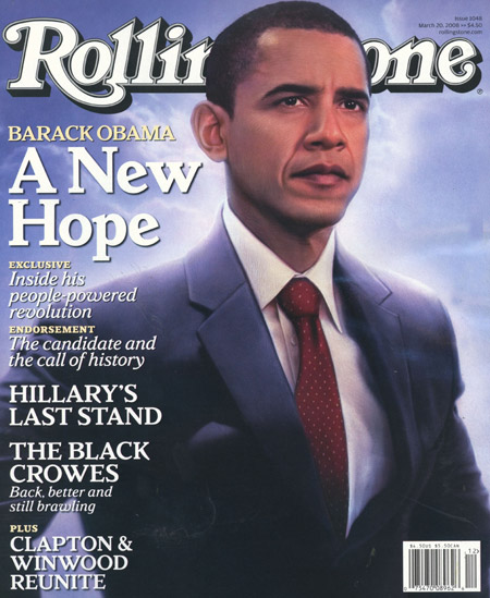
Rolling Stone released a very iconic Barack Obama cover. Just him and his flag pin. No name, no slogan and no eye contact. Pure faith and devotion. Compare to their last Obama cover, which made him look like a wax dummy of a superhero.
Again Obama, this time as an illustrated character on the cover of The New Yorker, sporting his Al-Qaeda gear and giving his sidekick, Angela Davis Michelle, the fearsome terrorist fist jab. The best comment on the controversy surrounding this cover comes from Gawker: “this obvious and heavy-handed satire has enraged Democrats and liberal media critics because now they are pretty sure this nation of child-like imbeciles will believe it to be an un-retouched photograph from the FUTURE.”
Predictably, this cover of Psychology Today caught my eye. Some nice use of type, but guess what? She’s wearing the corset backwards. How could something like be allowed to happen in 2008?
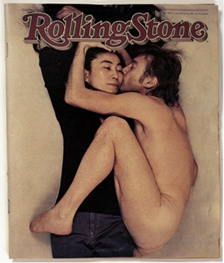
See, we’ve been thinking about magazine covers a lot over the past few months. Deciding together as a group on the cover of Coilhouse Issue 1 was a very intensive process. That decision’s been made, but to help myself think about what makes for a good cover in the future, I’ve started compiling a personal list of favorite covers, which I now share with you. I’ve excluded the undisputed heavyweight champions (John Lennon and Yoko Ono, Andy Warhol in a Campbell’s Soup Can, etc.) from my list. It’s going to be a Top 9, with the first 3 being posted today as part of a series. Enjoy!
This cover of Russia! Magazine is sexy, sexy, sexy. It’s also a cheeky remix of a controversial banned photograph titled An Era of Mercy. Two of Russia’s top male models were employed for this shoot, with real spacesuits on loan from the Memorial Museum of Cosmonautics. The hip new Russian culture magazine also does a great job with its cover lines: Issue 2 has a bear dancing with Marilyn Monroe on the cover and entices you with the promise of “Eight More Bears Inside.”
The ads above, part of a European AIDS prevention campaign, appeared today on my favorite advertising blog under the title “There Are A Lot Of FishDicks In The Sea.”
But before I tell you about more about this magical blog, a quick trip down memory lane: before blogging existed, back when I used hide in the school library because no would would sit with me at lunch, I discovered back issues of Consumer Reports and Ms. Magazine – in particular, their Selling It and No Comment back pages, which were eerily similar. Both departments critiqued advertising. Consumer Reports was strictly in the business of calling bullshit; highlighting self-contradiction, spoofing ridiculous copy, and pointing out deceptive images. Meanwhile, Ms. made it their mission to shine the spotlight on the advertising world’s misogyny. At 13, my obsessive love-hate relationship with advertising (currently a.k.a. “my job”) had begun.
All the pleasures I got from those magazines – from the pleasure of mockery to the pleasure of discovering an interesting photo, even if my beloved Ms. was hating on it – I now find at the incredible Copyranter blog. Copyranter is this phenomenally hateful individual, a New York advertising copywriter who’s been working at the same ad agency for the past 16 years. His bio consists primarily of his exhaustive shitlist: capri pants, advertising, advertising people, PR people, marketing people… the list goes on and on, ending with “men named Jack” and Scrabble. Almost every day, he provides ingenious commentary on a given ad campaign (usually ripping it to shreds) with inimitable elegance and wit. Lots of insight about the advertising industry, our culture, and the creative process here. To show you what I mean, I present some of my favorite posts in categories of interest below:
I love the low-tech cyberpunk styling of these images by Louis Decamps. No heavy digital editing here, instead it’s back to basics with lighting, wires and circuit boards we hold so dear.
The projections on the models’ faces suggest an imaginary environment; the glow of a lab, distant explosions, blue acid burn. The face paint and textures add to the storytelling aspect of this series, featured in issue 2 of Wound magazine.
I do question the series title’s I-Do-Ru reference: while awesome, its imagery seemed cleaner than these photos suggest. In any case, this is some crunchy eye candy!
Placid nuns with milky alien-beauty faces, glowing children with otherworldly skin conditions, and the most ordinary faces made strange by details such as a chalk-white complexion, a subtle change in proportions, overly-glassy eyes. These are the images of Russian artist Oleg Dou, who combines conventional photography with graphic rendering techniques to produce matching portraits of unsettling consistency.
Like many other good things, Oleg Dou’s art was introduced to me by Elegy Magazine. Elegy just released Issue 52, which features Alexander Hacke, Thurston Moore, Tim Burton/Johnny Depp, Nick Cave and Lisa Gerrard.
Her Modesty is a Muslim Fashion blog that will soon be a print magazine.
I’ve been reading Her Modesty, a Muslim women’s fashion blog. The project has a lot in common with Coilhouse: both Coilhouse and Her Modesty are blogs that will soon launch in print magazine format, both extoll the virtues of being covered vs. letting it all hang out (you may have noticed our obsession with covered necks, loosely-flowing clothes and total body coverage), and most importantly, both Her Modesty and Coilhouse are interested in the tenuous relationship between the “mainstream” and the “underground,” and where one stops and the other begins. They’re two different “undergrounds,” but the concerns are largely the same.
Primarily a fashion blog, Her Modesty’s main purpose is to display “how sisters can be covered but yet still feel good about themselves and how they look.” The blog author, Kima, obsessively catalogues her new favorite trends as inspired by street wear and the runway, follows the appearance of the hijab-inspired styles in Western fashion magazines, and offers readers tips on how to create the “modest version” of various popular styles. My favorite is this outfit, which in the author’s opinion walks the line, though her readers seem to love it.
Haute Hijab from the Her Modesty blog.
Kima’s writing tone reminds me of the sweet and upbeat Gala Darling, and similarly to Gala, Kima also challenges the readers by briging topics for discussion into the fashion mix. In one post, Kima posts a loose leopard-print D&G dress that resembles an abaya (the loose overgarment that’s worn by many Muslim women), and asks her readers, “would you rock it with a shiny red bag, black pumps, and a hijab?” In another post, Kima engages the readers in an interesting debate about the female “fashion police” in Iran. Similarly to my obsession with goths in TV commercials, there’s a post about a hijab-wearing girl in a Sunsilk TV ad. The most profound post, one where I almost felt like a voyeur when reading the impassioned comments, is the post where Kima asks readers if they’d still dress modestly if Allah didn’t will it.
But the best part are the hilarious Muslim Fashion Dont’s! Here they are, after the jump.
Thew new issue of Elegy is out! Actually, I think it’s more that the cover got leaked, which means that it’s about to come out. On the cover, a mask by Madame Khufu, as photographed by Spanish photographer Eccehomo.
Every time I get a new issue of Elegy, I mourn the fact that I’ve forgotten all my French. Luckily, every issue of Elegy is so packed with gorgeous full bleeds of photos and art from all over the world that even though I can’t understand a thing, the magazine is worth every penny. As Elegy’s main focus is music, each issue comes with a CD sampler; last issue, it included Neil Gaiman, Neubauten and Nurse with Wound.
Alyz Tale – Rédactrice en chef, photographer and muse
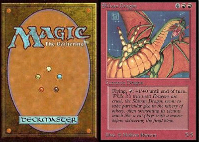
Shit, I loved that game! One of my happiest memories growing up was playing it with my dad. My favorite colors to play were black and green together; death and replenishment. I thought that red was for boneheads. I liked blue, but was never able to construct the kind of mindfuck blue decks that won you the game. And white was just… blah. Too pacifist. Green-white decks were for hippies. I remember liking artifacts; Magic was where I learned the word “ornithopter” from. Any time I opened a new pack, I prayed to find the coveted rare card Black Lotus; it would be like winning the lottery and I’d be filthy rich. I loved the artwork, which looks more crude to me now than I remember it being. Phil Foglio and Quinton Hoover were my favorite artists.
While I was a card-flopper, I was never a dice-chucker. I never learned how to play RPG’s because I didn’t know anybody else who played. But at the time, tons of card games were coming out right and left; games inspired by Lovecraft like Call of Cthulhu, the Illuminati card game inspired by Robert Anton Wilson, and the Netrunner game inspired by (ripped off without credit, I heard?) the work of William Gibson. This was my official exposure to all these artists and others, making Magic: The Gathering the official source of What Made Me Weird. My dad got me subscriptions to Scrye and Inquest, which had interviews with people like Clive Barker and Brom. In every issue of Scrye, they printed imaginary cards that readers made up, and I even remember submitting some of my own.


