This Can’t End Well: Shintaro Kago on YouTube

I’m mainly posting this for Nadya’s benefit, the little pervmeister, because I don’t think she caught the Pink Tentacle post; it would appear that Shintaro Kago now has his very own YouTube channel. Heaven help us all.

For those of you who have yet to “taste the unko“, Kago has produced some of the most disturbing manga imagery you’ll ever see short of Suehiro Maruo‘s or Keiji Nakazawa‘s… only his output is as likely to give you a bad case of The Totally Inappropriate Giggles as make you gag. These new animations, while crude in comparison to his more elaborate illustrated work, will likely do both.

Coilhouse Style Vanguard: Ryan Oakley

We’re reviving Coilhouse Style Vanguard, a column that spotlights stylish individuals from around the world. Previously, we featured Princest – you can read her segment here.

I met Ryan Oakley in Toronto lat year. It was during my exhibit at the Plastik Wrap boutique – Ryan had just purchased one of my prints and I was oohing and ahhing over his immaculate outfit. It was composed of a suit tailored so precisely it would stop fashion non-believers in their tracks and a shirt, tie, vest and socks all clearly chosen with expert care. He was a pinstriped vision, carefully treading the line between aristocrat and pimp.


Ryan Oakley with his print

The suit-as-hipster-gear has been around for a long time, but this guy looked like someone who truly understood and respected it. There was a certain je ne sais quoi… An air of “that’s right, bitches” about him that I found entirely justified. Last week Ryan put forth his suit expertise in an informative and hilarious post simply titled The Used Suit. In fact, Ryan writes about men’s fashion a great deal in his multi-faceted blog, The Grumpy Owl. From the About page:

Although Ryan Oakley began his career as a simple rake, he has since become Toronto’s most renowned flaneur and notorious dandy.  A composer of psychogeographic fictions, he is also a server of food, a tender of bar and a washer of dishes. While performing all these functions with efficiency and elegance, he has also found the time to publicly criticize books, theatre and the beleaguered women in his life. Mr. Oakley reserves some of his misanthropic vitriol for his own blog, The Grumpy Owl.

He’s also part of The Worldwide Culture Gonzo Squad, where he shares the blog-o-stage with several esteemed colleagues, including Coilhouse friend Jerem Morrow and Stylish Gent‘s M1k3y. So if Ryan’s masterful dandyism and tailoring insights aren’t enough to convince you that he’s one cool cat, check out some of his other posts, like Dinner With C’thulhu. It’s an instructional post where mister Oakley tells us how to entertain a precarious great old guest. Many topics are covered, from appropriate leather furnishing [“C’thulhu finds this comfortable as it allows ample room for Its tentacles but you will also be able to easily wipe any goo”] to dinner [“Human hearts are dreadfully difficult to obtain in today’s economy and the police tend to frown upon eating even the low quality, though well marinated, meat that can be found in your local hobo population”].

Without further ado, Ryan and his fashion philosophy, in his own words.

Tell us about the history of your look, its evolution.

I’ve been wearing suits since I was a child and, except for an unfortunate period during school, never lost the habit.  When I moved to Toronto I quickly discovered that everyone pays the wrong sort of attention to just another punk kid.  Since I was trying to drink underage and get away with a host of other ills, a suit and tie served me quite well.  These were simple black affairs, stolen from thrift shops, ran into the dirt, covered with blood, then replaced with another.

There’s a lovely mugshot of me wearing a grey pinstripe but, sadly, the police refused to give me a copy. The scum.

When I finally quit drinking and drugging, I discovered that I had money but no real outlet for what’s an obsessive monkey in my mind.   I dedicated myself, in earnest, to the vice of vanity.  Anything worth doing is worth overdoing and the money I may have put to some reasonable use is now going to my tailor.

What is your style philosophy?

Style is philosophy.  And I’m a logician.  I view clothing as being a system of syllogisms, paradoxes and axioms.  Like music or math, it attempts to be a pure expression of platonic reality.  Colours, patterns and textures must harmoniously combine to form an elegant truth.

Because this is my view, I pay no attention whatsoever to fashion.  Nor do I dress to express my office, my personality or my surroundings.  I wear a suit because I’m a western man and the suit is the single best item of clothing we have.

Aside from being a recognizable and well-governed medium, thus an interesting one to innovate in, it also appeals to and combines the fundamentals that every animal uses in its fur and feathers.  That is, the handicap principle, aposematism, cryptis and mimicry.

A suit is not a vulgar symbol of wealth, a display of superiority or an expression of bourgeois respectability.  It is a beautiful thing.  When I put one on, I hope for it to look equally normal and equally weird one hundred years in the past and one hundred years in the future.  That’s the meagre dimensions of the sartorial truth I aspire to.

Click below for the rest of the interview, a video and more photos, of course.

A Toast… To Preserved Shit in Jars.

You can’t go wrong with preserved shit in jars. You just can’t. It’s like a secret handshake. You like shit in jars, you’re on my team. We bond over Mütter mystique. I liked Alien: Resurrection, you hated it, but I know how we both felt about that scene.

And that is why Creature Feature is a site for sore eyes.  I’m sure that there are many more modern, fluid ways to locate images of these types of “creature-infused” wines from Indo-China; for example, I just tried typing “scorpion wine” into Flickr, and got 192 crisp (and probably crispy!) results. Still, there’s something precious and ordered about the musty pre-CSS presentation of Creature Feature that draws me. I like looking at that ancient HTML table, reverently stacked with aged Seahorse Wine, Centipede Wine and Toad Wine, the same way I like drifting away into a Joseph Cornell piece. I love stumbling across pages like this, pages that feel like they’re from another Internet that’s totally gone. We should preserve them.

All Tomorrows: Choose Your Own Adventure Edition

Choose Your Own Adventure is all about choices. In a way it is a simulation model, an approximation of reality without the risks of the real world. You make choices leading to different endings. If you don’t like the ending, you can start again with different choices leading to a different ending.

We as individuals and as societies make choices all the time. The history of our species is amazing: fire, numbers, alphabets or pictographic language, medicine, architecture, money and banking, art, music, laws etc. Choices got us there. We are still making choices both as individuals and societies. Not all of them are good – but, we can change the bad choices, we hope.
-R.A. Montgomery

Since the last column consisted of an in-depth tackling of Joanna Russ’ classics, I thought it appropriate to do something a little lighter for this edition of All Tomorrows.

The perfect subject arose when, while rooting around in an old box in my seemingly endless closet, I found an ancient (1980) era edition of Space and Beyond, one of the first in the famous Choose Your Own Adventure series that I’m sure many of us thrilled to as wee lads and lasses.

As I opened the somewhat frayed and yellowed volume, I anticipated a nice, clean jaunt down Nostalgia Lane.

I was wrong. Horribly, terribly wrong. I had forgotten just how bizarre some of the rants of Choose Your Own Adventure founder/author R.A. Montgomery were, and how utterly dedicated he was to mercilessly crushing any youthful fantasies of becoming a (enormously chinned, if the old artwork is any indication) sci-fi adventurer.

So, after galavanting around the universe for a little while, I run into this:

A chance to go to the unknown is probably really risky, but there is that desire in most people to take big risks. You race back in time toward the edge of eternity, the beginning of the entire universe. You achieve an elastic weightlessness, and a sense of complete peace and calm. There is no sound, no light. But no darkness either. You race back to the very beginning, to the pulsating, exciting start. You return to the big bang that started the whole thing. You are and have been a part of everything, always. The beginning is the end.

The End.

Great. It doesn’t stop there either. I’d venture to say that Space and Beyond, along with Montgomery’s similarly bizarrely philosophical entries in this series for kids are responsible for more nascent strangeness and miserabilism in my generation than any children’s book since Bridge to Terabithia.

Better Than Coffee: Judi Sheppard Misset

Morning! Are any of you still in your sleep schlubs? Got 4 minutes to spare before heading to work?

For your consideration:


Shake it sugar, do it to it. Double dog dare ya. Aaow!

Physical fitness doesn’t get more nerdcore than this vintage clip of Judi Sheppard Misset and friends dancing to “Move Your Boogie Body” back in 1982. But let’s not laugh at Judi, let’s laugh with her; Jazzercise turns 40 this coming October. The woman-based, woman-owned company is still going strong, raking in $93 million last year in spite of the lousy economy. At the core of its long-winded success is Misset herself, with her unabashedly goofy Midwestern pep squad accent and megawatt energy level.

At 61 years of age, Misset is still teaching several classes a week and changing up the franchise routine every 10 weeks. Said franchise now incorporates yoga and pilates into its hour-long classes, and provides thousands of job opportunities for women worldwide. Alas, no more wacky 80s hairdos… but hey, legwarmers and sparkly leotards are still kosher. Find it! Feel it! Do it! Aaow!

A couple more butt-blasts from the past after the jump.

Coilhouse Tees Unleashed on the World

Rejoice! The new Coilhouse shop at shop.coilhouse.net is up and running, and the promised limited-run tees are available for all. Go there now! Buy! Buy! Buy! CONSUME!

For those of you who missed the post this weekend, here is everything you need to know about our new tees. For the TL;DR crowd, here are the bare essentials:

  • Shirts come in two different styles and cost $19.99
  • These particular shirts will only be offered this Monday-Friday, and never again.
  • We’re printing these shirts after we receive the last order on Friday. It will take us 1 week to screen-print all the shirts and ship them all.

Issue 02 wants to come along for the ride. If you’re getting a shirt and haven’t picked up Issue 02 yet, now’s the time to get both and save on shipping. Issue 01 is completely sold out now (even the non-limited edition), and there are just 250 copies of Issue 02 left in stock. Get one before they’re gone, or you’ll regret it for the rest of your mortal existence.

As always, thank you so much, everyone, for your support. Every day, you’re helping us make Issue 03 and continue doing what we love. Squishes to every one of you!

First-Ever Coilhouse T-Shirt: On Sale This Monday!

Get ready to INFORM. INSPIRE. INFECT! Next week, and next week only, we will be offering our first-ever limited run of Coilhouse tees.

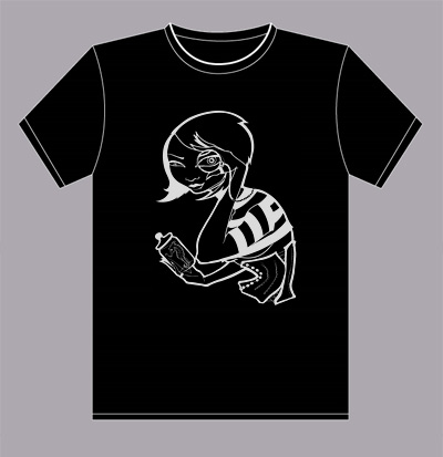
We’re screen-printing these shirts in reflective silver ink on black T-shirts from American Apparel. We will be offering two different unisex styles, which you can check out in the pictures after the jump. On the front, we have the monocled, corseted, seahorse-obsessed INFORM cover girl from Issue 01, drawn by Zoetica (here’s the original sketch). On the back, our slogan. Simple, sexy, eye-catching.

The shirts will go up for sale on Monday, and the last day to order will be on Friday. This window of time will be your last chance to get a Coilhouse shirt for a while, because after this sale is over, it’s crunch time on Issue 03 for us. It will be your only chance to get this particular style.

Image gallery, sizing chart and mini-FAQ about the shirts after the jump. Other questions are welcomed in the comments.

Sydney’s Gay and Lesbian Mardi Gras in Tilt-Shift

Tilt-shift miniature faking is a technique for making images of real-life lanscapes look like tiny scale models by manipulating the focus and shooting from a specific angle. Keith Loutit a master of this craft; he’s shown us beaches, harbors and a monster truck rally from the point of view of a giant child. His latest video of the Sydney Gay and Lesbian Mardi Gras is the most fascinating of all. The disco candyland we see here is the straight out of the religious right’s worst nightmares about where the world is heading. Watching this felt like someone crammed Dziga Vertov and Zombie Zombie into one sparkling mini-masterpiece. Enjoy! [Thanks, Kelly]


Mardi Gras from Keith Loutit.

Survival of the Bravest

I became a graphic designer mostly because I love stuff. Specifically, I love paper. My career ambitions have changed over the years, but somewhere in my mind was always the notion that I wanted to produce cool two-dimensional stuff — photographs, stationary, magazines — stuff and things made of paper. This love affair with paper has led me to hoard years worth of fashion, music and design magazines, postcards, advertisements and what have you. In these particular economic times, it’s become fashionable to say the publishing industry is dying — dead, even — and who am I to argue when a recent New Yorker has only twelve pages of ads in it? Who am I indeed, but a crazy, stupid hopeful paper-obsessed idealist?

I dream of a publishing industry reborn, emerging from the ashes of poverty burned clean, pruned back and more beautiful than ever. I dream of a Darwinian rebirth, where only the most audacious and gorgeous of publications will survive; a rebirth only possible in the internet age where every niche market can find its products with the tap and a click of a search field and mouse. The popularity of sites like Magazine Death Pool is hard to ignore; once popular and award-winning titles seem to be dropping like flies. But this, I say, is the day of the unique, the individual, the small-run and the special. In order to survive a magazine can no longer count on appealing to everyone blandly; a magazine must be something more in an attempt to rise above the fray. It cannot be dedicated to the dissemination of information, because the internet does that better and faster than any printed publication could. It must embrace its status as an obsolete object and revel in its old-fashioned tactility.

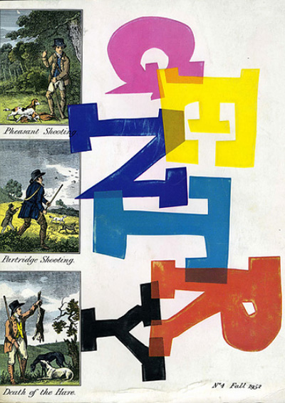
In the 1950s there was a magazine that did just that, in unprecedented fashion. I’m speaking of Gentry Magazine, a footnote in publishing history and the subject of an illuminating little essay by Stephen Heller that I happened to read this year. Published quarterly in the 1950’s by William Segal, Gentry was unabashedly aimed squarely over the heads of the riff-raff at the “100,000 men” who were cultivated, sophisticated and wealthy enough to “get it”. Produced at great expense with first-rate papers, sumptuous printing, die cuts, embossing, fold-out pages, product samples and color plates, the magazine cost 8 dollars for a yearlong subscription. This was going out on a pretty big limb for the publishers if you consider the average magazine issue cost in the 50s was about 25 cents. I can’t believe they sold it so cheaply.

The erudite content centered on men’s fashion and gentlemanly pursuits like riding and smoking, along with articles about food, wine, art, history and culture. Segal saw the publication as both an exclusive club for those cultivated enough to appreciate it and an educational tool for those aspiring to appreciate it. Endeavoring to reach beyond the pages and engage with the audience, he included many unusual treats. An article about suits would include a swatch of fabric for the reader to touch; an article about smoking might include a tobacco leaf to smell; an article about riding was famously accompanied by a small sample of oats. Henri Matisse did a cover in 1956, which is not surprising, given Segal’s desire to elevate the magazine to the realm of fine art. Each goodie — each fabric swatch or color plate — was hand-placed and glued, a fact that was celebrated as proof of the value of the extravagant book, giving it more in common with fine art than mass-produced pop rags.

If I came across a publication such as this today, it would take my breath away. The sheer opulence and ambition of it (even now, when those fabric swatches needn’t be hand-glued as they were in the 50’s), coupled with a high level of respect for the reader’s intelligence, would floor me. The publishing industry is dead, you say? Magazines are history, you say? I declare, I would buy any magazine that could floor me like that. Even in a recession, I would buy the ever loving fuck out of it. I also declare with equal certainty that as long as there are people like me who love paper, magazines can never die; they can only get better as they battle for attention.

Now, be nice and stay away from my Gentry ebay auctions and no one will get hurt.

Yes, Yes, We Would Wear It.


Kermit coat by Jean-Charles de Castelbajac, “ready-to-wear” outfit by Lie Sang Bong. Below: Pepi’s-inspired hair action by fashion students from the Universidad Pontificia Bolivariana.

NBC has pulled together a lovely gallery consisting of 100 crisp, large-sized images from various recent fashion shows, titled: “Would You Wear It?” I love finding outlandish new designs, but quickly tire of sifting through hundreds of dull runway photos on places like Style.com in order to find them. So these kind of galleries – which usually have names like “Looks You Won’t Be Caught Dead In” – are extremely helpful. All the images in this post are from the NBC gallery except for the muppet one – that I found here. I also enjoyed NBC’s crystal-clear Gaultier and McQueen galleries. I’d seen photos of both these collections before, but the photography here is the best. The makeup in the McQueen collection is terrifying!


Uber-hot mask by Lydia Delgado. Imagine wearing that with these shoes! And nothing else.