Modern Mucha
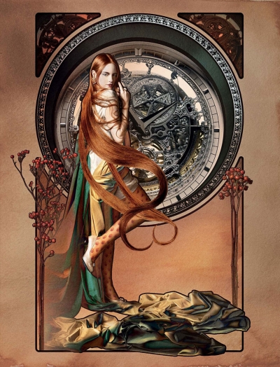
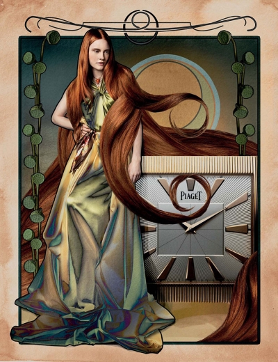
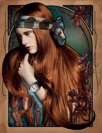
Last month marked the 150th anniversary of the birth of Czech artist Alphonse Maria Mucha, father of Art Nouveau. In celebration — and to advertise some, no doubt, absurdly priced wristwatches — photography studio Mierswa-Kluska put together a shoot chock full of decorative borders and swirly, tendril-like hair entitled “Temp Nouveau” for Plaza Watch a magazine dedicated, obviously, to the aforementioned timepieces. It’s mostly successful in replicating Mucha’s ornate style though when juxtaposed with a flesh and blood person some of his trademark design elements can seem a bit jarring. Mucha’s figures always felt integrated with his decorative flourishes and that feeling is lost here. Still, niggling criticisms aside, it’s a wonderfully imaginative concept. You can see these images and the rest of the set at a much higher resolution at the link below.
Via Wicked Halo : NOTCOT : Super Punch


August 10th, 2010 at 8:57 am
I very much admire his work. His style is really wonderful, I love those delicate details of his. These photo/illustrations are not too bad, I do agree the feeling in them is a wee bit on the hollow side. However, a humble tribute, rather than an over the top one, is appreciated.
August 10th, 2010 at 9:03 am
It’s eye catching but the technique leaves a lot to be desired. Some parts feel like really bad Photoshop or incomplete – like it needs something more going on in the layers to bring it all together.
It’s a good idea though – lots of potential here that was out of the range of those who worked on it. If not that then maybe another example of designing by committee.
August 10th, 2010 at 9:34 am
The best tribute to a great artist is to use their iconic imagery to sell some stuff.
August 10th, 2010 at 8:08 pm
Many of Muchas illustrations were in fact advertisements, so it seems only fitting…
August 11th, 2010 at 3:42 am
I think it’s cute cause of how commercial a lot of Mucha’s trademark style art was, even down to the product placement (eg cups of tea with elegantly swirling steam)
But come on – this isn’t creative or well executed enough to be worthy of this illustrious site – there’s no actual skilled drawn elements, just a few hesitant outlines, vector bits and filters.