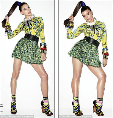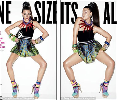
Three Kickstarter Projects Worth Supporting: Take This Book, Cakeland and Ethical Corsetry

2011 was an incredible year. With all the hope, uncertainty and weirdness that lies ahead in 2012 – election year, Alan Turing Year, the year of the Mayan Apocalypse, the year that 2011 seeds come to fruition – why not start on a good karmic note? Three incredible Kickstarter projects need your help. Here they are, in order of how soon they’re ending:

Take This Book: The People’s Library at Occupy Wall Street. A nonfiction book by Melissa Gira Grant that tells the story of the The People’s Library, as imparted by many of the librarians that maintained it in Zuccotti Park before the police raid on November 15th. Here is an excerpt from the book. To many people, the destruction of the library was a painful moment in Americna history; the image of police throwing carefully-curated, free books from the volunteer-run library into dump trucks felt like a symbol for the repression of free speech.

“Take This Book is an extended essay — just over 10,000 words — based on the stories of the librarians and the library’s patrons. (Maybe you were one of them.) It can’t be the whole story, because it’s still happening.” Donating $1 will get you a digital copy of the book, and donating $20 or more will get you a print edition. For $250 or more, you can get a signed and numbered “People’s Library” print from Molly Crabapple, seen above. There are only 18 hours left on this campaign at time of writing. Donate now!

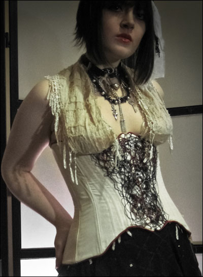
Rachael Reichert’s Ethical Luxury Corset Collection. When you Google image search “eco clothing” and variations thereof, you get a lot of green and earth tones, lots of yoga pants, and more than a fair share of loose, flowy dresses. This is great, but it leaves many of us who care about ethical clothing of a more vintage/fetishy persuasion out in the cold. Designer Rachael Reichert wants to take on the challenge of crafting a collection of luxury corsets using nothing but ethical, fair-trade and (when possible) locally-sourced material.

Her fabrics will will include organic cotton that is grown, woven, and dyed according to Global Organic Trade Standards in India, as well as peace silk or wild silk, produced by a process in which “fibre is pulled out from the cocoon after the moth has emerged, and hand spun.” Reichert plans to use steels bones, vintage twill tape, aluminium grommets, and locally handmade bobbin lace as well as her own signature handmade thread lace. The goal is to make luxurious, elegant alternative clothes “with a clean conscience”.

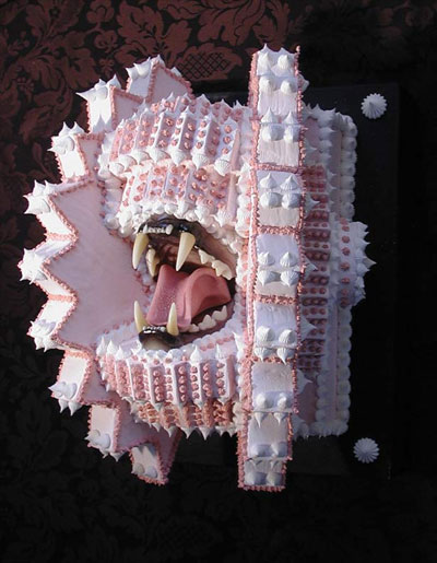
Cakeland. A giant, cake-themed art installation built by Scott Hove. A magical wonderland of icing, joy and despair. See the beautiful high-res images over at Hi-Fructose. Cakeland will feature “60 full length mirrors, cake chandeliers, theatrical lighting, moving parts and sound to make the most stunningly beautiful and lush mirror maze and art installation you will ever see.”

The most incredible thing about this version of Cakeland (smaller ones have been built before) is that it’s entirely mobile! Cakeland will probably travel to your city, or a city near you. Help make Cakeland happen, and you will one day be able to walk its delicious halls.

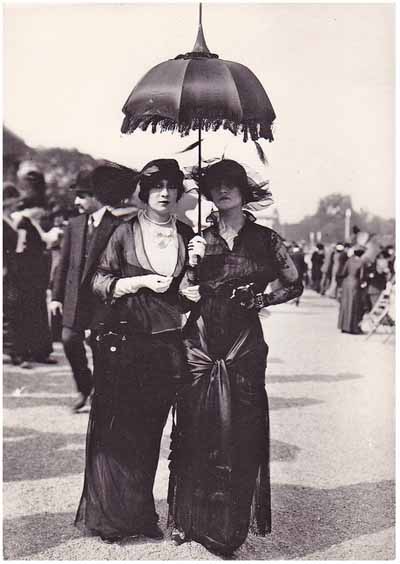
Parisian Proto-Goth Beauties, 1910


(The Lene & Nina of their time?)

Darling Madame Darla Teagarden recently shared this image, saying “Early Parisian Goths, 1910. How amazing were they? Very.”

Oh, indeed! VERYvery. That is some unparalleled late fin de siècle bohemia-infused fierceness, for sure. A bit of Google-fu has helped me trace this scrumptious photo as far back as one Mrs. Inman on Flickr. Inman’s photostream is full of all kinds of wonderful vintage postcard scans… she’s a seriously devoted collector and curator. Her tags indicate that this is a century-old French photo postcard from her vast personal archive.

Dang, right?

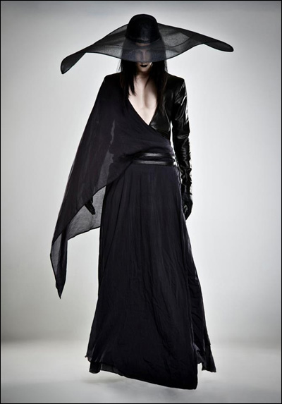
“What would a modern wizard wear?” Mother of London 2012.

Clothing designer Mother of London (previously on Coilhouse here and here, and many times in the print magazine) is getting ready to release a ready-to-wear line of clothing and an online shop. The new collection consists of the designs seen here, as well as limited-edition leggings and t-shirts that have not yet been photographed. The inspiration for this line, says designer Mildred Von Hildegard, comes from wizards. “What would a modern wizard wear?”

Much of the collection is unisex. “Gender plays a little bit too much role in the outside world,” says Mildred, “so I’m kind of dismissive of it [in my own work].” Some of the pieces are specifically cut for men or women, “but the men’s stuff in particular can be pulled over by either gender.” Like much of Mother of London’s past work, much of the clothing has a past-meets-present, out-of-time quality about it. There are feathered jackets, bad-ass biker-babe dresses with sleeves that resemble medieval suits of armor, skirts that look like they’re made out of a dozen belts, and wide-brimmed sorcerer’s hats. And if that wasn’t enough, Mildred is also working on a more elaborate, couture collection for 2012. No photos have been released, but Mildred refers to it as “Mother of London… on crack” and alludes to the fact that it’s highly tailored and detailed.

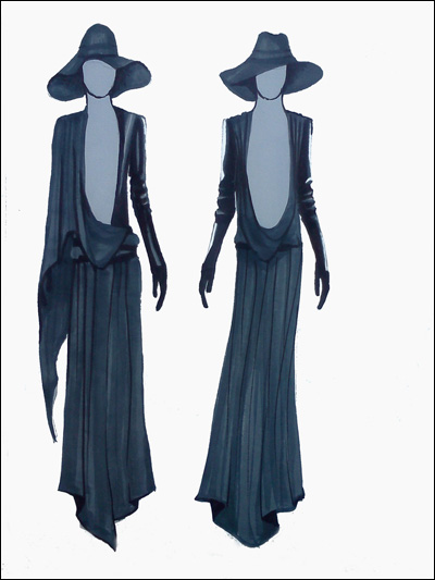
After the jump, more final images, concept sketches, and “making-of” shots from the new Mother of London collection. It’s amazing how much the concept drawings match the final pieces.

LONG LIVE RUBULAD. (Keep the Party Going!)

“I had some kind of epiphany about not chasing something in the above-ground world. Something happened in me that I no longer wanted to be in a band that wanted to be famous and go on tour. I just wanted to do something that was ours. I guess it was firmly planting myself in the underground, not after some kind of success that my parents would like.

…In the olden days of New York they had bands and dancing. Dancing and performers of every kind — spoken word, circus, whatever — in the same venue. Places like the Mud Club or Danceteria had a lot of different spaces and a lot of different installations and all kinds of different people went.

And then this weird thing happened when it suddenly became all giant discos and little rock bars. And those people never went to the same place anymore. It seemed like when we started doing Rubulad that people really wanted to be in the same space. They wanted to watch a band and go dance. And be happy.”

~Sari Rubinstein, co-founder of Rubulad, interviewed by Nonsense NYC


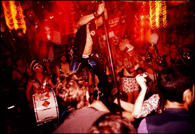
Photo via the Essentialist.

Oh, loves. We cover a lot of micropatronage drives on da ‘Haus, but the Rubulad Kickstarter project is especially near and dear. They have been an indescribably huge inspiration to many, many people involved with Coilhouse.

What is Rubulad? Back in 1993, two lovely souls named Sari Rubinstein and Chris Thomas took out a lease on a 5,000 square foot basement in south Williamsburg. Maybe a dozen other people got in on that initial deal, mostly artists and musicians in need of a cheap communal space where they could spread out and work. They all started building up and decorating the space communally. Soon, it became a fun, subterranean hang-out location that drew all sorts of kindred spirits together for dinners, readings, rehearsals, etc.

After a while, Sari, Chris, and their cohorts started throwing parties to cover each month’s rent. Over the course of the next few years, Rubulad (cleverly named with touch-tone letters that corresponded to the space’s phone number)’s space began to evolve, to literally bloom (with vibrant paper flowers, glittering murals, rope vines, colored glass, paper mache sculptures), and the parties developed into these elaborately themed bohemian blow-outs. They. Are. Fucking. AMAZING. For seventeen years now…

(Hang on, let’s take a moment. Seventeen. YEARS.

Yeah.)

…Rubulad has been instrumental in planning and throwing all kinds of events. They’ve already had to move their main warehouse space twice, but their warm, inviting DIY ethic has never faltered or changed; it’s only grown stronger.

In Defense of H&M’s Fembots

Fashion retailer H&M recently got called out for using computer-generated bodies in their online catalogue.

The company has admitted that the bodies are “completely virtual,” with faces of real models pasted in. “This is a technique that is not new, it is available within the industry today,” said an H&M spokesperson. “The virtual mannequins are used in the same way as we use mannequins in our stores for ladies wear and menswear.”

Bloggers have responded with appropriate criticism. Norwegian Broadcasting Corporation spokesman Helle Vaagland said, “this illustrates very well the sky-high aesthetic demands placed on the female body.” Blogger T.M. Gaouette writes, “I’m confused! If the intention is to just show the items of clothing, then why put real heads on fake bodies? Why not just put a fake head on the fake body? Is the real head needed so that we can relate to the models as human beings? But how is that possible when we are faced with a perfect body to which no one can relate?”

On Facebook, a couple of friends expressed concern that this trend will decrease the number of jobs available to working models. Another issue is the creepiness factor: “Man,” writes Jenna Sauer at Jezebel, “isn’t looking at the four identical bodies with different heads so uncanny?”
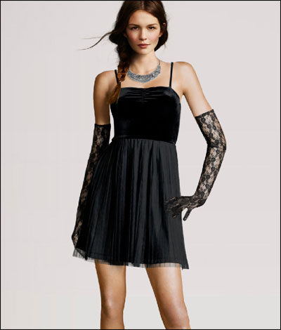
With that in mind, there are a few beautiful and amazing things going on here. First of all, there’s the unintentional modern art: this catalogue has brought us the haunting, Ringu-esque Model Without a Face. Also, this foray into the uncanny valley brings us one step closer to the age of the idoru. With teenage pop idol Aimi Eguchi, whose face is a composite of six different singers, and vocaloids (singing synthesizers) such as pigtailed holographic superstar Hatsune Miku, we’re almost there. And even though H&M’s online catalogue conforms to the same beauty standard as any other big fashion retailer, this technology actually has the potential to subvert the paradigm altogether.

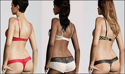
Imagine an online shop where your preferred weight/height/measurements are used to generate 3D models of the bodies that you want to see. Imagine if there was an API for this that could be used across all online clothing stores you visit, so that no matter what site you were looking at, the models appeared the way that you wanted them to. Standardized beauty ideals would become less relevant, because people would have greater control over their exposure to them.

In the short term, it may seem like computer-generated models reinforce a homogenous beauty standard. In the long term, this technology may pave the way towards greater body diversity and inclusiveness.
EDIT: After some wonderful discussion in the comments, I’m appending my responses to the post:

Some of you have pointed out that advertisers aren’t known for championing body diversity. It’s true. Perfume companies hire leggy, angular supermodels to to sell you a lifestyle. Some female-targeted TV commercials begrudgingly include the token African-American women (especially, for some reason, when selling yogurt, cleaning products and tampons), but it’s rare to see them go beyond that. If you read Sociological Images, you know how often advertisers and companies create ads that are super-racist, sexist or classicist even in this day and age.

The reason why I think this has a chance of succeeding is that the advertising and retail branches (or outsourced teams) of a company have totally different goals. The goal of advertising is to make you aware of the brand, and to associate that brand with glamour, mystique, etc. That’s why fashion and editorial models are very tall and have exotic, alien features – Andrej Pejic, Alek Wek, etc. On the other hand, catalog models tend to look “wholesome” and just slightly more attractive than average. Your mileage may vary – the Victoria’s Secret catalog models will look more glamorous than the ones from Gap, and these H&M girls are on the more glamorous side – but generally, catalog models are supposed to be a very standard type of “pretty” that’s not supposed to make people insecure, because they want you to feel happy when you make the purchasing decision. Here are a few models from the Macy’s catalog… I think they’re pretty, but I don’t think that they’re “impossibly” pretty. They look like women I see every day:

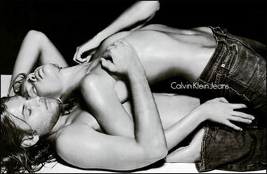
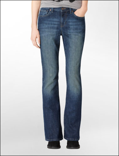
Advertising makes people feel insecure, like they’re lacking something, with the implicit message that buying this brand will make them somehow more attractive or fulfilled. But that’s not the goal of a product shot. The goal of the product shot is to make the average consumer feel like the item is right for them. Consider the difference between the Levi Jeans ad campaign and the completely neutral, non-threatening, disembodied product photo on their website:

Calvin Klein Ad:
Calvin Klein Product shot:
It’s true that almost all models presented in catalogs are still uniformly size small. That’s because they are often modeling samples, before the full line of clothing is produced. Samples are manufactured in size small because that’s always been the industry standard. Most of that is for practical reasons: size small clothing is faster and cheaper to produce, because it requires less fabric and time. But with advanced 3D modeling, that convention may go out the window as far as online catalog photos go. (I’m sure it’ll remain as a standard in the fashion world for a long time). There’s already a company called http://fits.me/ that’s working on this. It’s not as advanced as H&M’s one-size-fits-all fitting room interface, but hopefully it’ll evolve in that direction.

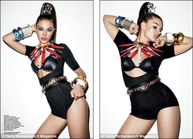
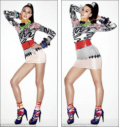
H&M doesn’t deserve TOO much praise because they didn’t really step outside the status quo with their use of digital models, but I don’t think they should be criticized, either. Their fake-bodied models were no skinnier than any real models that they would’ve used otherwise. I worry that if the blogosphere crucifies them, and so far that’s what has happened, then other fashion retailers will get discouraged from trying this type of technology in the future because they’ll think that people are just uncomfortable with it, and that it doesn’t test well. Ms. Magazine wrote in an op-ed about this, “Sign here to urge H&M to use real women to model its clothes.” If H&M does that, then it definitely won’t make any lasting change, because they’d just go back to using real Size 2 models. However with digital imaging, we can end up with a catalog that lets you change the size and shape of the clothing, looking something like this, only with more variations:
This Week in Anatomical Fashion

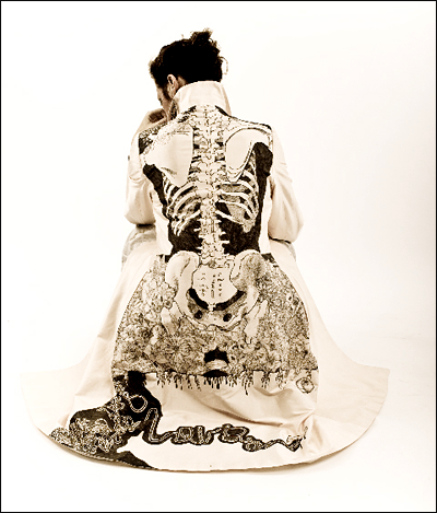
Beautiful hand-drawn coat by Jamie Avis. Jamie drew this using 10 felt-tipped pens. More images here. [via bloodmilk]

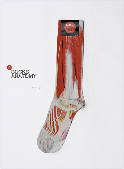
“Socks Anatomy” designed by Anton Repponen. Sadly, physician this is just a concept design, ampoule but you can find real anatomical socks (not a impressive, but still cute) in the Haute Macabre comment thread, where this was found.

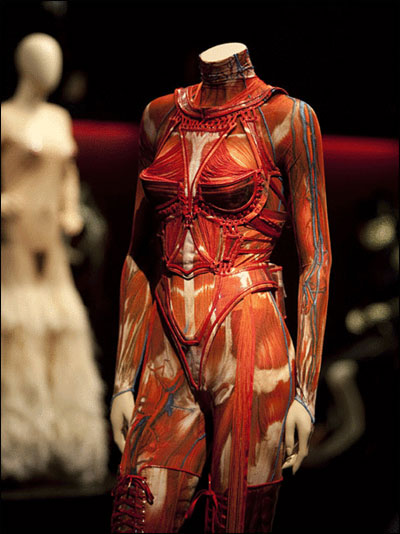
And finally, these socks could go nicely with this Gaultier Anatomical Bustier, currently on display at the Dallas Museum of Art.

Breathing New Life into Dead Men’s Patterns: An Interview with Artist Hormazd Narielwalla


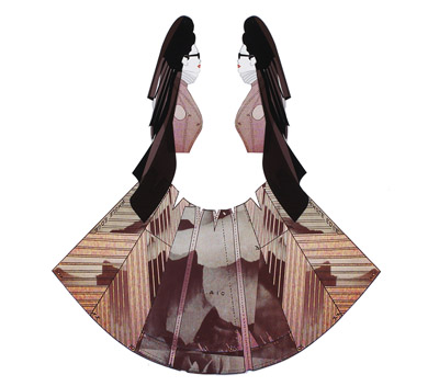
From the “Fairy-God, Fashion Mother” series by Hormazd Narielwalla.

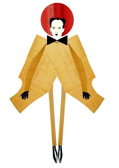
Born in India of Persian-Zoroastrian ancestry and now living London, artist Hormazd Narielwalla forages for patterns in historic tailoring archives to use in conjunction with his own photography, sketches and digital compositions, giving their forms new life as whimsical narrative works of art.

You can see some lovely examples of Homi’s unique work in our Issue Six feature devoted to Klaus Nomi. The puppet-like pattern collages are taken from Narielwalla (nickame Homi)’s series A little bit of Klaus…a little bit of Homi. Each Nomi figure contains elements extracted from the vintage bespoke pattern blocks of Savile Row tailors, made for customers now long-deceased. We could not have found a more deeply fitting serenade to the operatic, avant-garde style icon than Narielwalla’s work, with its deft mixture of affection, craft, and thoughtfulness. (Thank you again, Homi.)

In the following interview, Narielwalla tells Coilhouse a bit more about his work and his life. His current show, Fairy-God, Fashion-Mother, which features a series of paper collages inspired by cult curator Diane Pernet, will be viewable at The Modern Pantry in London until January 7th.


From Hormazd Narielwalla’s “A Little Bit of Klaus, a Little Bit of Homi” series.

How did you get started making art, and what eventually drew you to this very specific and personal form of creative expression?
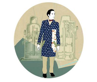
I was pursuing a Masters degree at the University of Westminster, aiming to become a menswear designer specializing in alternate ways of communicating fashion. During one of many research meeting with William Skinner (the Managing Director of Savile Row tailors Dege & Skinner), I acquired a single set of bespoke patterns belonging to a customer, now-deceased.


From the “Dead Man’s Patterns” series by Hormazd Narielwalla.

The tailors no longer needed the patterns, as they were made for a shape that no longer exists. With the support of my mentors British designers Shelley Fox and Zowie Broach (from Boudicca), I followed my instinct to divorce the patterns from their original context, viewing them as abstract shapes of the human body instead. That is when and where my first publication, Dead Man’s Patterns, was conceived.

Art Of The Mundane Part II: Ironing A Shirt

A sequel, see of sorts, recipe to a video previously posted in these pages. Here we abandon the shining of shoes for the act of ironing shirts, and while this may not have quite the same, fantastic soundtrack found in the first video, the precision is still here. This is a man who has ironed a shirt or thousand in his time. I can only presume that, at some point, there was a series of clips meant to instruct men on the proper upkeep of their clothing, but I might be entirely wrong. Regardless of the original intent, they remain utterly captivating.

Thanks, Ian!

“Mechanical Dolls” Editorial for Vogue Italia


Via Lana Guerra. Thanks, doll!

A backstage peep at photographer Tim Walker’s phenomenal ‘Mechanical Dolls‘ editorial for the October 2011 edition of Vogue Italia, featuring models Audrey Marnay & Kirsi Pyrhonen. Brilliantly styled by Jacob K. — a truly breathtaking amalgam of outmoded automata and puppetry, paired with delicate vintage French, British and Japanese garments. Make-up by Val Garland, hair by Malcolm Edwards.


Photo by Tim Walker from the “Mechanical Dolls” editorial, Vogue Italia, 2011.

“Polarity Song” By Seventeen Evergreen

I’m not really sure how I feel about this song by Seventeen Evergreen but the video, directed by Terri Timely, is pretty wonderful. Tapping into the inherent weirdness of those refuse repositories known as thrift stores, it features a people being suck surreptitiously into piles of shirts and racks of pants by knit-clad troglodytes. They are then brought into a nightmarish world, some sort of multicolored hallucination in wool and argyle, where their kidnappers mummify them in bits and pieces of discarded hats, sock, and sweaters. So basically, what usually goes on in thrift stores.

Thanks, Matt!