The price of your excesses
The price of your vile excesses, capsule originally uploaded by Coilhouse.
“The end of the Green Fairy”, via Musee Absinthe.
Curious Absinthe prohibition posters from early 20th century France.


The price of your vile excesses, capsule originally uploaded by Coilhouse.
“The end of the Green Fairy”, via Musee Absinthe.
Curious Absinthe prohibition posters from early 20th century France.


Remember when people in the New York goth scene dressed like this? No? Okay, me neither. I missed out on the glory days of the New York Scene as well, and I have these paintings by Steven Assael to rub it in. I don’t know if it was truly as magical and mysterious as his paintings make it seem, but I do know that the people in them are real; here’s a picture of goth club legend Johanna Constantine, looking every inch as amazing in real life as in the painting above.The painting above is part of a sculpture called At Mother (Mother was an actual club in New York), which has the people above standing like guardians at a set of double doors. The doors of the sculpture (which can be seen after the jump) open to reveal the painting below:


Honestly, I hadn’t been missing NYC at all since I moved out west last May. Then the autumn equinox hit. Ever since, I’ve been aching to take a long bike ride through the fiery foliage of Prospect Park.
My soundtrack of choice would be Light Is Calling, an album by Bang on a Can co-founder Michael Gordon. Its title track was written specifically for this stunning short film of the same name by Bill Morrison:
Gordon and Morrison previously worked together on Morrison’s full length movie Decasia. Both pieces build around a very simple premise; film is a fragile medium. Nearly all of that old nitrate-based film stock is too grimy and scratched, rotting and stinking of vinegar to be of much use to film preservationists. Morrison salvaged 70 minutes of archival footage from someone’s rubbish bin, stitched it together and re-shot film that showed decay or was actively decaying, frame-by-frame, using an optical printer.
The cumulative effect is breathtaking, and for reasons that are difficult to articulate, will always remind me of New York in the fall.
(Readers in Antwerp will be delighted to know that the Vlaams Radio Orkest are providing live accompaniment to Decasia on October 21st, as well as what I’m sure will be a stentorian rendition of John Cage’s 4’33”. *cough*)

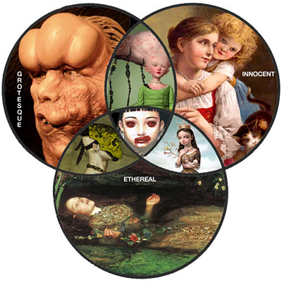
I’m a huge fan of the Babyart Livejournal Community, where people post pictures of tentacled, glass-eyed, pigtailed nymphettes that resemble broken dolls and frequently have their arm in a sling. The term “babyart” was originally just the title of Trevor Brown’s art website (don’t click it, mom!), but has since broadened to refer to the type of themes found in the art of Mark Ryden, Ray Caesar, David Stoupakis, Lori Earley and a number of other people who probably hate the idea that I’m mentioning them all in the same sentence together.
Once in a while, some misguided soul wanders onto the Babyart LJ thinking it’s a community about “Art, But With Babies In It” and posts something like this. Some people may like these pictures, but personally, it’s not why I joined the community. No, for me, this is what it’s all about! And this, and this, and this. One day a few months ago I got so fed up with the off-topic posts that I created this handy Venn Diagram to help establish some guidelines, a kind of subjective pocket guide:

My Babyart Venn Diagram was a hit. Still, I’ve still yet to figure out why “Babyart” has become such a huge phenomenon in the past few years, why this generation has embraced its themes like never before. Was there some show we all watched as kids that warped us into lovers of disturbing-cuteness? Is it some sort of cultural awareness of a loss of innocence? Any theories?


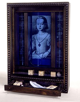
Soap Bubble Box, originally uploaded by Coilhouse.
The magical curio cabinets and collages of Joseph Cornell make me pine for a Manhattan I never knew, for all things mildewed, dusty and indigo-hued, for faded starlets and forgotten prima ballerinas, and for constellations I have never seen.

Born towards the end of the Victorian era in upstate NY, reclusive Cornell never ventured any further than New England, but his body of work reveals an inner world of incalcuable depth. Inspired in equal parts by the penny arcades of his youth and the grandiose vision of the Dada/Surrealists, Cornell spent a lonely lifetime trawling L.E.S. flea markets and secondhand bookstores for nostalgic scraps of yesteryear. Whatever the medium (diorama, film collage, decoupage), each piece reflects the inexorable drive of a compulsive scavenger/architect to coax meaning and narrative –however mysterious– from discarded scraps of the past.


monorogue, originally uploaded by Coilhouse.
In vein with the hologram photos earlier, another odd, though more common medium. Usually I am, admittedly, prejudiced against 3D modeling, but something about Japanese artist Almacan’s work appeals to me. Maybe it’s that the medium suits the subject matter. His part Escher part Giger constructions are, undeniably, very 90s, but tonight I don’t particularly mind. Too busy being delighted by all the propellers and wishing I were watching Videodrome, or Tetsuo, for that matter.
More Almacan images here.


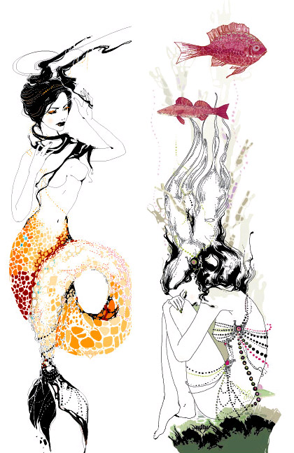
Capricorn and Pisces, from Yana’s ongoing Astrology Series.
Yana Moskaluk is a young illustrator from Russia. As a teenage goth living in Siberia, Yana decided to pursue a career in the arts and moved to Moscow to begin work when she was only 19. Yana’s work is dark and playful, and shares many characteristics with that of Aubrey Beardsley; a balance between intricate linework and clean planes of color, the influence of Japanese printmaking and love for the sensual and the grotesque. Coilhouse recently caught up with Yana for a quick Q&A:
Coilhouse: You’re currently in the middle of illustrating a series of Zodiac illustrations. Do you believe that astrology really works?
Yana: Astrology — yes. General horoscopes from magazines — no. This series of illustrations is a commercial work for a magazine, so I’ve started to draw it not on my own.


My multi-talented pal Wiley Wiggins has just finished the gorgeous video “Magic Horse” for Austin-based band Horse + Donkey.
Having been a bit overwhelmed lately by blanched, washed out, sepia-tinted, Dover-collagey everything, surreal footage that looks like animated Lomo imagery is delightful change of pace. Plus? Ponies!


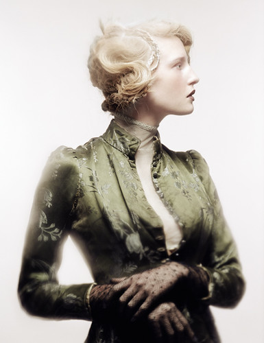
Paris-based 24-year-old photographer Andy Julia is a versatile artist whose commercial work has sincere gothic sensibilities, and whose gothic personal work creates an intimate vintage atmosphere. Andy became known in the alt world through his contributions to Elegy Magazine, and chats with Coilhouse about his first photoshoot, his new book, agency models vs. alt models and other interesting topics below:
Do you remember the first photo shoot you ever did?
Yes I remember perfectly. I was a 17 years old teenager who’d just discovered the sense of love. I began my first roll in shooting my girlfriend innocently. I was unconscious of what photography was, and felt really out of all material conditions…
This first roll had a very hard light, supplied by a simple bedside light. Her skin was wrapped in a piece of black satin, and her legs hidden behind beautiful stockings, she was wearing a black velvet men’s “Haut de forme” from the end of the 19th century…our bed was surrounded by mirrors. We just made only one roll this day, as the teacher asked to us at the Beaux Art school, to learn how to develop and to print photographical pictures. This roll changed my life forever, and I was not conscious of that.


This building is called the Wolkenbügel, or Cloud-Iron. It was designed – though never built – in 1925 by artist El Lissitzky. That’s right – 1925! As in many of his other works, which spanned vastly different media, the Wolkenbügel underscores Lissitzky’s belief in the beauty of industrial production and a desire for pure monuments of technological progress.
There’s something very dark about Lissitzky’s propaganda art. Not dark in any sort of contrived “I’m trying to scare you” kind of way; on the contrary, his still, supreme and aphotic images are filled with nothing but love.

