Machinarium

machinarium_pottedpalm

Yes, yes. You’ve already seen blurbs about Machinarium all over the friggin’ bloggitysphere. But when a game this scrappy and adorable and smart and just painfully lovely pops up, we can’t not archive it here.

Amanita Design is the Czech indie game studio who brought the ‘wub those delightful point-and-click adventures, Samorost and Samorost 2. Aesthetically, their latest creation follows somewhat in Samorost‘s footsteps, but delves far deeper. For all its gorgeous visuals, ambiance, clever puzzles, and creaking, rusty robot action, what sets Machinarium apart and above other point-and-click games is its surprising depth. Such tenderness and subtlety, humor and intelligence!

machinarium1 copy

This is worldbuilding of the highest caliber, with a compelling narrative that slowly unfolds as you play through, bringing Wall-E, Perdido Street Station and The City of Lost Children to mind in equal measure. No spoilers. Just click here, try out the demo, and you’ll understand why it might just be the best 17 bucks you spend all month.

1 Triceratops, 2 T-Rexes, 30 Boners, Infinite Nerdgasm

Check out this astounding stunt from the popular German game/entertainment program, Wetten, Das..? wherein three life-sized dinosaurs crash the party:


(Via Cathy Tree Harris, thanks!)

Okay, first things first, I think we can all agree that cuffed blue jeans are probably not the way to go when you’re wearing the most incredible baby T-Rex costume puppet ever friggin’ made in the history of EVAR. But still. Holy shit, right? Someone over at Geekologie sums up my own feelings about this clip quite well:

Let me tell you: when that [baby T-Rex] first came running out I thought it was CG. But it wasn’t. And neither were my 30 boners! My God, I’ve never wanted to be part of a live studio audience so bad in my life.

WWDTREX

Seriously! Well, it turns out that if you live in the UK, US, Canada or any number of cities in Europe, you can have your Brachiosaurus and meet it, too. The dinos in that clip are only three of over 10 species featured in a spectacular live arena show spin-off of the cherished BBC series Walking With Dinosaurs. Creature designer Sonny Tilders and his crew used their extensive knowledge of puppetry arts and animatronics to bring these long-extinct giants back to life.

Coilhouse field trip, anyone?

(More photos and clips after the jump.)

CP 1919 Woolen Cape

Other purists may throw rocks at me for saying this, but… REALLY, REALLY WANT:

UNKNOWNPLEZZORRZ
(Via Darla Teagarden.)

MMMNNGGHPH. Browns, why must you insist upon torturing a grubby, low-rent gal like me with that ridiculous price tag?!

Related anecdote: A snarky acquaintance of mine back in NYC used to enjoy cornering club-going trustifarians who dared to don the “Unknown Pleasures” tee and making them squirm by demanding that they explain the image they were wearing. If their answer wasn’t knowledgeable enough to his liking, he’d trap them against the DJ booth and deliver lengthy lectures on pulsar theory, the film Stroszeck, or cocaine-in-a-condom drug mule death statistics.

(Annoying as he was, I kinda miss that dude.)

Zoetica Ebb’s BIOREQUIEM 5.0

We’re SO stoked for Zo today! After a year in aesthetic stasis, her personal website, Biorequiem, has finally relaunched with a gorgeous new look. Our favorite cosmonomad is a busy bee; she barely has time to initiate her patented Zobogrammatronic ambient energy battery recharge system, let alone find a spare moment to whip up sexy new design and code, so she enlisted Nubby Twiglet (our awesome Coilhouse Indie Ad Grid designer) and Star St. Germain to help her. And now the proud mama crows  “here it is – hussied up, blushing and ready to be sent out center stage with a brisk slap on the ass.” Huzzah.

You’ll find all sorts of goodies at Biorequiem 5.0. Art! Photography! Illustration! Memoirs! Bewbz! Chihuahuas!  Anthropomorphic cybercows! Go get some.

X Planes: Spend a Day in the Troposphere

Hey, Jean
This is Henry McClean
And I’ve finished my beautiful flying machine…

tumblr_kpd35xLzmO1qzsgg9o1 copy
Via xplanes: The Magnus Spherical Airship prototype, 1982.

Don’t let anybody steer you different; Andrew B’s x planes Tumblr is straight-up anachro-airship porn. Andrew has been posting scores of “weird and wonderful aircraft pictures and stories found both on the web, and in print” over there for the better part of a year now. You can get lost in the archives for days:

experimental aircraft. exotic aeromachines. oddities. sleek silver cigars. pedal-o-trons. soviet hive-mind bombers. aerial joy. the olden days. action shots. propaganda posters. etc.”

Where’s your fucking jet pack? You don’ need no steenkin’ jet pack when you’ve got a Gyrodyne Model GCA-55. While you’re dreaming, have some Convertawings. How about a Switchblade jet? Check out the wingless jet WASP, the Bat-Winged Cantaliver jet plane, the steam-powered Giffard. MmmnnggmpfffssSPLOOOOOGE.

07-b-2
1909 Aviation Show, France.

Some more choice excerpts from x planes after the jump, but seriously, if you have a few minutes (or a few hours) to spare, just get over there and explore. Motherload.

The Art Of Opening Bottles

Bottle caps are a particular source of shame for me, being as they are at the center of a particularly awful incident. Upon a hot summer afternoon a few years ago, in search of a salve for my burning thirst, I walked into my local drugstore and approached the soda counter. The jerk was busy with a young woman and her daughter who, being all of what seemed to be six or seven, was having an issue deciding exactly what to order. Not wishing to wait for my refreshment, I walked over to the cooler and extracted a frosty bottle of pop. Upon returning to the counter I looked over at the woman who, now aware of my presence looked over and, smiling politely, apologized for her offspring’s indecision. Telling her not to worry, I took my newly procured bottle of pop, pressed the neck of the bottle against the edge of the counter and preceded to execute the Donovan’s Reef maneuver.

Why I chose to attempt such a feat is a bit of mystery to me, even now. It may have had something to do with the fact that the woman was fairly attractive and I did it in an attempt to impress her or maybe it was just that the gleam of the counter’s edge caught my eye, calling to me and I was unable to resist its siren call. It may have been both but regardless, as my hand came down to strike that bottle cap it dawned on me that I had never actually done this before and as my hand struck the bottle’s neck I thought that perhaps this was a bad idea and I should have at least practiced this, preferably in the privacy of my own home, before using it in public to impress attractive mothers, and as the bottle shattered and glass broke the surface of my skin I thought that these were all excellent thoughts.

Granny Fashion

Let it never be said that I am fashion conscious. That is not to be taken in the traditional sense, that I do not take care in my appearance for, while this is true — a fact to which my various burlap and sack cloth ensembles attest — I mean “not fashion conscious” as in I am almost unaware that people design clothes in a way that would be pleasing to the eye. I am fashion comatose. I am fashion regressive.

This fact was probably not immediately aware to my new colleagues but it was not long after I arrived at the Catacombs, wearing a newly acquired potato sack, that it began to dawn on them that something might be amiss. Escorted into a deceptively large and well lit boardroom I was seated at a large table. Here Nadya, in what I assume was a generous act of good faith, laid out an impressive spread of photographic content which would be appearing in the third issue of their magazine. Obviously anticipating a thoughtful reaction I made an effort to appear knowledgeable. Picking up one of the photos I scrutinized it fastidiously, pursing my lip and nodding in what I hoped was a convincingly savvy manner. Finally, after a seemingly endless forty seconds I placed the photo down, leaning back and tenting my fingers I said, with absolute authority “These are beautiful. That dress makes her bosom look really impressive.” I need not tell you that the silence in that room was deafening.

You must then take my enthusiasm for these reading glasses with something approaching a brick of salt. It is all together possible that my enthusiasm for these glasses from Filao — which are being distributed on this continent by French Melody — stems from a shameful fantasy of them hanging round the lily-white neck of a svelte, Alt-librarian. This is a bad reason to like something, especially considering that there are no Alt libraries near me, nor in existence. Still, there’s something about the masquerade aesthetic and the ability to fold them away that is undeniably appealing, even to someone as fashionably brain-dead as yours truly.

Magazine of the Day: Emigre


Top: Issue 01 (1984), Issue 22 (1992).
Bottom: Issue 32 (1994) & the final issue, 69 (2005).

I love any magazine that pulls you into a completely subjective universe through a unified front of design, tone and subject matter. The kind of magazine that shouts, “Hello! Welcome to my world! Get ready to be immersed.” Like a good horror film that forces you suspend your disbelief enough to feel, for two hours, that there really are flesh-eating parasites crawling through the phone lines, a powerful magazine should convince you, if only for the time that you read it, of its world view. Whether the goal of the magazine is to convince you that there are still paranormal mysteries in the world or that you do have someone akin to an older sister out there who understands your growing pains, every great magazine has always had a personality and a viewpoint.

All this week, I’ll be chronicling magazines from the past and the present that I think accomplished just that. We’ve already cited a few of our magazine love affairs – see our posts on Gent, Skin Two, Mad, Die Schönheit and Mondo 2000. Many magazines still deserve a mention. Like… you know that the Sassy blog post is coming. You know it. Cabinet. Merz. I don’t spoil all the surprises, so you’ll just have to wait and see. The magazine of the day, though, is Emigre. I’ve just discovered that there’s a wonderful gallery of Emigre covers and layouts, chronicling the magazine’s 69-issue existence from 1984 to 2005. From Wikipedia, a brief history:

Art-directed by Dutch-born Rudy VanderLans using fonts designed by his wife, Czechoslovakian-born Zuzana Licko, Emigre was one of the first publications to use Macintosh computers and had a large influence on graphic designers moving into desktop publishing (DTP). Its variety of layouts, use of guest designers, and opinionated articles also had an effect on other design publications. The focus of Emigre was both redundant and wandering — both positive qualities as a journal produced by a tight and evolving group of designers and writers with Vanderlans at the center…. The magazine began in 1984 with a focus on the émigré. The first eight issues were concerned with boundaries, international culture, travel accounts and alienation (as the issues’ titles suggest).

I discovered this magazine when researching fonts for the first issue of Coilhouse. I came across a font called Mrs. Eaves, designed by Zuzana Licko, and became fascinated by the font’s story and the designer behind it.  As Ellen Lupton writes in Thinking With Type, “the font, inspired by the eighteenth-century designs by John Baskerville, is named after Sarah Eaves, Baskerville’s mistress, housekeeper and collaborator. The couple lived together for sixteen years before marrying in 1764.” This hidden history fascinated me, prompting me to research women in typography. Through this I arrived at Licko and Emigre. (We never did end up using Mrs. Eaves in Coilhouse… but you may recognize it from the lovely WordPress logo.)

It’s fascinating to see how Emigre both evolved and stayed loyal to its roots during its 20 years of publication. Start at the beginning and enjoy! [Thanks, Joe.]

A Toast… To Preserved Shit in Jars.

You can’t go wrong with preserved shit in jars. You just can’t. It’s like a secret handshake. You like shit in jars, you’re on my team. We bond over Mütter mystique. I liked Alien: Resurrection, you hated it, but I know how we both felt about that scene.

And that is why Creature Feature is a site for sore eyes.  I’m sure that there are many more modern, fluid ways to locate images of these types of “creature-infused” wines from Indo-China; for example, I just tried typing “scorpion wine” into Flickr, and got 192 crisp (and probably crispy!) results. Still, there’s something precious and ordered about the musty pre-CSS presentation of Creature Feature that draws me. I like looking at that ancient HTML table, reverently stacked with aged Seahorse Wine, Centipede Wine and Toad Wine, the same way I like drifting away into a Joseph Cornell piece. I love stumbling across pages like this, pages that feel like they’re from another Internet that’s totally gone. We should preserve them.

Survival of the Bravest

I became a graphic designer mostly because I love stuff. Specifically, I love paper. My career ambitions have changed over the years, but somewhere in my mind was always the notion that I wanted to produce cool two-dimensional stuff — photographs, stationary, magazines — stuff and things made of paper. This love affair with paper has led me to hoard years worth of fashion, music and design magazines, postcards, advertisements and what have you. In these particular economic times, it’s become fashionable to say the publishing industry is dying — dead, even — and who am I to argue when a recent New Yorker has only twelve pages of ads in it? Who am I indeed, but a crazy, stupid hopeful paper-obsessed idealist?

I dream of a publishing industry reborn, emerging from the ashes of poverty burned clean, pruned back and more beautiful than ever. I dream of a Darwinian rebirth, where only the most audacious and gorgeous of publications will survive; a rebirth only possible in the internet age where every niche market can find its products with the tap and a click of a search field and mouse. The popularity of sites like Magazine Death Pool is hard to ignore; once popular and award-winning titles seem to be dropping like flies. But this, I say, is the day of the unique, the individual, the small-run and the special. In order to survive a magazine can no longer count on appealing to everyone blandly; a magazine must be something more in an attempt to rise above the fray. It cannot be dedicated to the dissemination of information, because the internet does that better and faster than any printed publication could. It must embrace its status as an obsolete object and revel in its old-fashioned tactility.

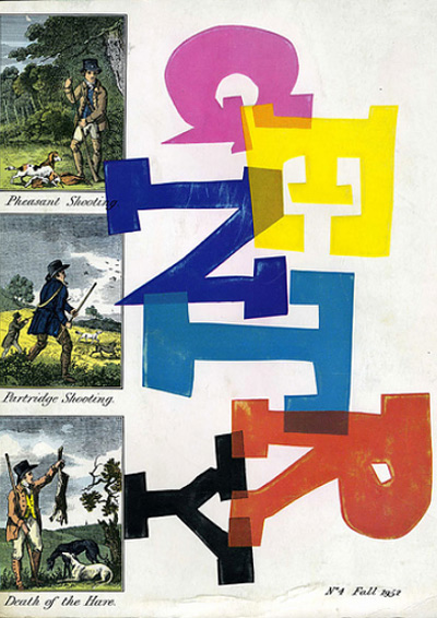
In the 1950s there was a magazine that did just that, in unprecedented fashion. I’m speaking of Gentry Magazine, a footnote in publishing history and the subject of an illuminating little essay by Stephen Heller that I happened to read this year. Published quarterly in the 1950’s by William Segal, Gentry was unabashedly aimed squarely over the heads of the riff-raff at the “100,000 men” who were cultivated, sophisticated and wealthy enough to “get it”. Produced at great expense with first-rate papers, sumptuous printing, die cuts, embossing, fold-out pages, product samples and color plates, the magazine cost 8 dollars for a yearlong subscription. This was going out on a pretty big limb for the publishers if you consider the average magazine issue cost in the 50s was about 25 cents. I can’t believe they sold it so cheaply.

The erudite content centered on men’s fashion and gentlemanly pursuits like riding and smoking, along with articles about food, wine, art, history and culture. Segal saw the publication as both an exclusive club for those cultivated enough to appreciate it and an educational tool for those aspiring to appreciate it. Endeavoring to reach beyond the pages and engage with the audience, he included many unusual treats. An article about suits would include a swatch of fabric for the reader to touch; an article about smoking might include a tobacco leaf to smell; an article about riding was famously accompanied by a small sample of oats. Henri Matisse did a cover in 1956, which is not surprising, given Segal’s desire to elevate the magazine to the realm of fine art. Each goodie — each fabric swatch or color plate — was hand-placed and glued, a fact that was celebrated as proof of the value of the extravagant book, giving it more in common with fine art than mass-produced pop rags.

If I came across a publication such as this today, it would take my breath away. The sheer opulence and ambition of it (even now, when those fabric swatches needn’t be hand-glued as they were in the 50’s), coupled with a high level of respect for the reader’s intelligence, would floor me. The publishing industry is dead, you say? Magazines are history, you say? I declare, I would buy any magazine that could floor me like that. Even in a recession, I would buy the ever loving fuck out of it. I also declare with equal certainty that as long as there are people like me who love paper, magazines can never die; they can only get better as they battle for attention.

Now, be nice and stay away from my Gentry ebay auctions and no one will get hurt.