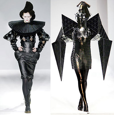
It’s been a little bit over a week since the launch of this site, and I want to thank everyone for their comments and support thusfar. I want to extend a special thanks to everyone who’s suggested a link – we’ve discovered so much interesting new stuff thanks to all of you! There are a lot of submissions to go through, and tonight I’m going to drop this gem: designer Gareth Pugh, submitted by Alysa.

From Wikipedia: Pugh’s collections are autobiographical rather than referential, and draw inspiration from Britain’s extreme club scene. Pugh’s trademark is his experimentation with form and volume. He often uses “nonsensically shaped, wearable sculptures” to “distort the human body almost beyond recognition.” Elements in his designs include PVC inflated into voluminous coats, black and white patchwork squares, Perspex discs linked like chain mail, and shiny latex masks and leggings; he has used materials including mink, parachute silk, foam footballs, afro-weave synthetic hair, and electrically charged plastic in his clothing. Pugh describes his designs as being “about the struggle between lightness and darkness, like Nancy Kerrigan versus Tonya Harding.”
Posted by Nadya Lev on October 18th, 2007
Filed under Fashion, Goth | Comments (4)

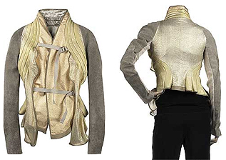
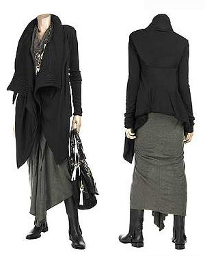
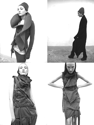
You’ve discarded your crushed velvets. You’ve cast aside your zippered, D-ringed, and safety-pinned garments and long for something new. Where do you go from here? You require sophistication. You want drama without the bell sleeves. We understand.

Allow us to suggest you closely examine the work of Rick Owens. While his designs are not exactly pocket-book friendly, they do wonders for the imagination. Even if you won’t shell out for his stuff, you’ll certainly learn a thing or two about layering, proportion and structure. No matter how odd a garment, his tailoring is spot-on every time, flattering to most bodies, and, above all, painfully hot. This is style, damn it.

Posted by Zoetica Ebb on October 16th, 2007
Filed under Fashion, Goth, Shopping | Comments (8)
Below is a collection of the top 5 TV commercials that feature goth characters (and one special bonus, after the jump!). Whether or not you’re goth, these are hilarious. Most of these were made by large corporations such as Dell and Kodak, but surprisingly, one of the most well-produced and high-budget-looking commercials below was done by a gothic clothing company! Of course, that commercial is not American, but European. Here it is:
Sinister Clothing:
[kml_flashembed movie="http://youtube.com/v/DoYGO9jKrLY" width="400" height="330" wmode="transparent" /]
The tagline at the end of the commercial translates to “clothing your mother hates.” Even though the US is not yet at the advanced level of advertising goth clothing on TV, there are some progressive outlooks on goth culture in the commercials after the jump below:
Posted by Nadya Lev on October 15th, 2007
Filed under Goth, Silly-looking types | Comments (3)

Cheeky monkey Emily Rishea submits her fashion label, Artifice Clothing, through our submit form: “hey why not, I feel shameless,” she writes. Okay, we’ll bite! Artifice does a great job with all the classics and invents some new ones, such as these Victoria’s-Secret-meets-the-Rocketeer light-up mechanical wings. The range also has bit of a sense of humor, as can be seen in this Bunny Lolita ensemble, which the site describes as “terrifying”. But my absolute favorite item on the site has to be this Cybertek Collar, which makes you look like a Dr. Who villain from the Tom Baker era. In an era of Victorian future, the one person who rocks up wearing this as part of an outfit inspired by bad 1970s sci-fi tech will be the envy of the tea party indeed.
Posted by Nadya Lev on October 14th, 2007
Filed under Cyberpunk, Fashion, Goth, Technology | Comments (5)

Remember when people in the New York goth scene dressed like this? No? Okay, me neither. I missed out on the glory days of the New York Scene as well, and I have these paintings by Steven Assael to rub it in. I don’t know if it was truly as magical and mysterious as his paintings make it seem, but I do know that the people in them are real; here’s a picture of goth club legend Johanna Constantine, looking every inch as amazing in real life as in the painting above.The painting above is part of a sculpture called At Mother (Mother was an actual club in New York), which has the people above standing like guardians at a set of double doors. The doors of the sculpture (which can be seen after the jump) open to reveal the painting below:

Posted by Nadya Lev on October 13th, 2007
Filed under Art, Fashion, Goth | Comments Off on Steven Assael: Classic Portraits of a Scene

In addition to his fashion designs and his epic weight loss, remedy Karl Lagerfeld is also known for his fashion photography. The above is from Vogue Germany October 2007.
The Story: “Wellen”
Photografed by Karl Lagerfeld
Fashion Editor: Christiane Arp
Models: Claudia Schiffer and others
See the rest on foto_decadent.
Posted by Nadya Lev on September 28th, 2007
Filed under Fashion, Goth, Photography | Comments (2)

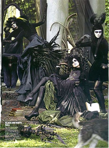
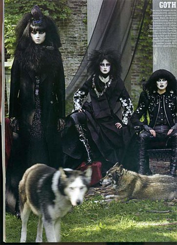
W Magazine Goth Spread, originally uploaded by Coilhouse.
Originally posted by my friend Kat – see her entry for larger pics of the above.
Posted by Nadya Lev on August 30th, 2007
Filed under Fashion, Goth, Photography | Comments (7)
