Sunflower, the Centaur Disney Wants to Forget

In 1940, Disney released Fantasia; an epic animated film consisting of several shorts set to classical pieces. If you haven’t seen it, it’s perfect for the holidays. There are fairies and unicorns and dancing mushrooms.

And, of course, Fantasia includes the Pastoral Symphony. As a child, I was happily unaware of the heteronormative, gender essentialist overtones of this piece. I was just excited to see all the centaur boobs and watch the fashion show unfold. Multicolored centaurettes wearing hats made from lotus flowers, birch bark and even live white doves. Exotic mythical creatures lazing around all day, spending the beautiful sunset hours eating grapes, swinging on giant swings, and bathing by the waterfall. It was just lovely. Looking back, it’s clear how ridiculous the whole thing was. A post at Nectarade provides a hilarious, pitch-perfect overview (click through to the site, it’s better with pictures):

There’s a centaur meetup and the ladies are “dressing up” so it’s not so obvious they’re all clones of each other in different colors. The males are also clonic, but they don’t give a shit about looking alike because they’re there for the mare pussy (well, that sounded funny). Also, there are some weird “little cherubs” playing as sassy gay friends of the girls, matchmakers, makeover artists, and creepy voyeurs. My first reaction: “Why are there cherubs in Olympus, anyway? I suppose they’re sort of little cupids without the bow and arrows, but it’s still fucking weird.” I did my homework, and those things are called putto (plural: putti) . Oh, okay, it makes sense artistically then. It’s still weird because they’re little creepers in this movie, but I’ve learned something new today!

…meanwhile, the clonic Ken doll centaurs get their own catwalk show from which they pick the girl they want to fuck senseless take to the prom. I don’t know if it’s racism or narcissism or fashion taken to the extreme, but I can’t help but notice that all the pairings have similar color palettes. Red/pink/brown/yellow goes with red/pink/brown/yellow, blue/purple goes with blue/purple. That’s very disappointing. You can also tell how much the couples want to have sex as soon as possible, but they can’t because there are little kids watching (and depraved putti stalking them).

Seriously, they have to settle with a lot of second-base touching and inane activities such as playing in swings and eating grapes and just hang out, sitting here consumed with lust for the rest of the evening. But OH NOES!! EMERGENCY!!! DISASTER!!! ONE OF THE CENTAURS IS ALONE! Don’t worry, guys! There’s a centauride who’s also alone! And in the same color scheme! We’re saved! How convenient that there was the same amount of boys and girls! So our team of putti, like fanbrats who feel compelled to pair every character up in the bad fanfiction they write, set them to a date by playing their phallic flute-trumpets. Thankfully, our two dorks liked each other and were actually the ones with less libido. Actually, they’re quite sweet and old-fashioned, and I’m glad for them. I mean, as happy as it can be since the putti are still stalking like Edward Cullen in Bella Swan’s period days, and even when they drop the curtain (literally) they’re still peeking over the centaurs. Eww, GTFO!

The above review of Pastoral Symphony was pretty complete… except, HELLO, WHAT’S THIS:
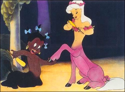
That’s right. Disney originally included a character named Sunflower – a half-donkey, half black girl servant figure who polished hoofs, brushed/decorated tails, and carried garlands for the centaurettes. It’s not surprising that Nectarade didn’t catch them; the scenes haven’t appeared on any release of Fantasia since the 1960s, and are hard to come by in high quality. Most versions on YouTube look like they were taped off a television. Here is the best-quality collection of all censored scenes. Sister Suffragette adds, “there’s also the possibility that there are more Sunflowers; the movie shows Sunflower with a couple different hair styles which could mean that they actually represent several servant/slave half-asses. It’s hard to tell, though, because the difference in hair style is the only distinguishing feature … of course she was happily shining the hoofs and fixing the tails of the non-black centaurs and there’s not even any thought or explanation given as to why she’s the only one that doesn’t meet a mate by the end of the segment. The others females are chosen by the males who picked them out of the lot after the females paraded and posed in front of the males.”

The real kicker is that, according to several sources, Disney adamantly denied that Sunflower even existed up until somebody finally dug up the footage and put it on the internet (despite the fact that you can find her chowin’ down on watermelon, in stereotypical fashion, in the Fantasia cut-out book. Perhaps Disney was counting on the fact that it’s solidly out of print).

Recently, artists have been reclaiming and re-imagining Sunflower, so perhaps there’s a silver lining to all of this (as an aside, people are also reimagining some of the other Fantasia nubile centaurettes in a very – how shall I put this – non-heteronormative, non-monogamous way. Thanks, Rule 34. Thanks, Internet). People are imagining Sunflower (or Sunflowers) as a strong, confident young girl. Or a self-aware, independent woman. Or even painting her as a servant, but with much more emotion and character. If Disney won’t make this right, the people will. More remixes of Sunflower, after the jump.

Sunflower by AtomicFireball: “This is not a fanart. It’s a little wishful thinking of my own. This is my Sunflower, who never served a mistress.”

GAFFTA’s Galvanize

Tomorrow (Thursday) evening in San Francisco, non-profit arts organization Gray Area Foundation for the Arts – GAFFTA for short – is hosting Galvanize: a concert, dinner and art auction to raise funds for its many endeavors. GAFFTA is a Bay Area organization devoted to hacking, creative coding, and interactive art. The organization carries out its mission through education, art curation and research.

GAFFTA offers a host of classes with an emphasis in audio, visuals, web and physical interaction. Each of these concentrations is explored thoroughly. For example, the physical interaction classes highlight topics such as “various forms of 3D art, prototyping, multitouch interfaces, electronics, conductive fabrics and physical computing.” The current course catalogue offers classes on augmented reality, Arduino, visualizing and mapping data, and more.


GAFFTA for Ghostly International 10 Year Anniversary

In addition to its focus on education, GAFFTA also champions new-media artists worldwide. Recently, GAFFTA curated Future/Canvas², and exhibit on the emerging medium of iPad art. Previously, GAFFTA presented exhibits exploring urban futures and sound, data and mechanics. Artists whose works have appeared at GAFFTA include Robert Hodgin, Nicole AptekarAaron Koblin and Zimoun. Additionally, GAFFTA partnered with art group Ardent Heavy Industries to produce Syzygryd– a collaborative electronic musical instrument / interactive art installation with a 2.5 ton sculptural visualizer made of metal, fire, and a kilowatt of RGB LEDs.

GAFFTA’s research department exists to explore “the increasingly gray areas between art, technology, and society.” GAFFTA regularly hosts hackathons, offers collaborative research residencies, and has several large-scale initiatives and projects going on right now. And they even find time to host the occasional Cinema Speakeasy in their beautiful space below the historic Warfield building in mid-Market San Francisco. Last week, month, there was an Evil Dead double-feature with zombie dress-up!


A performance at GAFFTA.

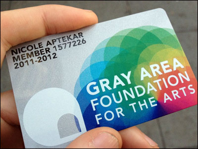
All these things cost money. And that’s why GAFFTA is throwing an epic bash in order to raise money for the new year. For $60, guests to the event become members of GAFFTA. This includes the snazzy membership card designed by artist Nicole Aptekar and gains entrants a 10% discount on workshops and ticketed special events in the future. Performing at the event wil be artists ELEW, Electric Method and Garibaldi. See more at the event page for GAFFTA Galvanize.


Membership card designed by Nicole.

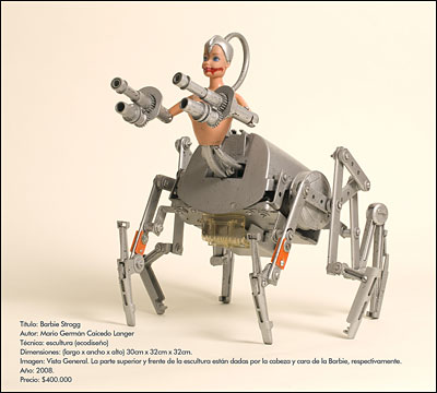
In honor of centaur week (previously and continuing on Coilhouse), and in keeping with the tech-art feeling of this post, I present you with this beautiful bionic centaur, titled “Barbie Strogg,” created by artist Mario Caicedo Langer. You can see a larger version of this sculpture here, and more of Langer’s work here. [via BoingBoing]


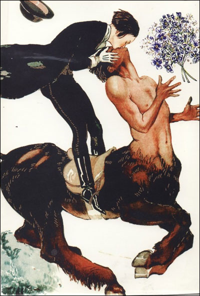
Some Hot Human-on-Centaur Action

This image was scanned by one malpertuis and captioned “A card I got when I was a kid – no idea on the artist.”

SO FAST. SO HOT. SO QUEER.

[via pig baby]

Editor’s Note: Coilhouse reader Dicyfer just commented that this is Centaur Kiss” by George Leonnec. It ran as cover artwork for the magazine La Vie Parisienne back in 1924. Thanks, Dicyfer!

In Defense of H&M’s Fembots

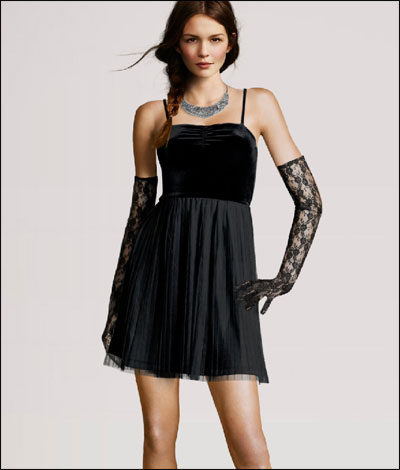
Fashion retailer H&M recently got called out for using computer-generated bodies in their online catalogue.

The company has admitted that the bodies are “completely virtual,” with faces of real models pasted in. “This is a technique that is not new, it is available within the industry today,” said an H&M spokesperson. “The virtual mannequins are used in the same way as we use mannequins in our stores for ladies wear and menswear.”

Bloggers have responded with appropriate criticism. Norwegian Broadcasting Corporation spokesman Helle Vaagland said, “this illustrates very well the sky-high aesthetic demands placed on the female body.” Blogger T.M. Gaouette writes, “I’m confused! If the intention is to just show the items of clothing, then why put real heads on fake bodies? Why not just put a fake head on the fake body? Is the real head needed so that we can relate to the models as human beings? But how is that possible when we are faced with a perfect body to which no one can relate?”

On Facebook, a couple of friends expressed concern that this trend will decrease the number of jobs available to working models. Another issue is the creepiness factor: “Man,” writes Jenna Sauer at Jezebel, “isn’t looking at the four identical bodies with different heads so uncanny?”

With that in mind, there are a few beautiful and amazing things going on here. First of all, there’s the unintentional modern art: this catalogue has brought us the haunting, Ringu-esque Model Without a Face. Also, this foray into the uncanny valley brings us one step closer to the age of the idoru. With teenage pop idol Aimi Eguchi, whose face is a composite of six different singers, and vocaloids (singing synthesizers) such as pigtailed holographic superstar Hatsune Miku, we’re almost there. And even though H&M’s online catalogue conforms to the same beauty standard as any other big fashion retailer, this technology actually has the potential to subvert the paradigm altogether.

Imagine an online shop where your preferred weight/height/measurements are used to generate 3D models of the bodies that you want to see. Imagine if there was an API for this that could be used across all online clothing stores you visit, so that no matter what site you were looking at, the models appeared the way that you wanted them to. Standardized beauty ideals would become less relevant, because people would have greater control over their exposure to them.

In the short term, it may seem like computer-generated models reinforce a homogenous beauty standard. In the long term, this technology may pave the way towards greater body diversity and inclusiveness.

EDIT: After some wonderful discussion in the comments, I’m appending my responses to the post:

Some of you have pointed out that advertisers aren’t known for championing body diversity. It’s true. Perfume companies hire leggy, angular supermodels to to sell you a lifestyle. Some female-targeted TV commercials begrudgingly include the token African-American women (especially, for some reason, when selling yogurt, cleaning products and tampons), but it’s rare to see them go beyond that. If you read Sociological Images, you know how often advertisers and companies create ads that are super-racist, sexist or classicist even in this day and age.

The reason why I think this has a chance of succeeding is that the advertising and retail branches (or outsourced teams) of a company have totally different goals. The goal of advertising is to make you aware of the brand, and to associate that brand with glamour, mystique, etc. That’s why fashion and editorial models are very tall and have exotic, alien features – Andrej Pejic, Alek Wek, etc. On the other hand, catalog models tend to look “wholesome” and just slightly more attractive than average. Your mileage may vary – the Victoria’s Secret catalog models will look more glamorous than the ones from Gap, and these H&M girls are on the more glamorous side – but generally, catalog models are supposed to be a very standard type of “pretty” that’s not supposed to make people insecure, because they want you to feel happy when you make the purchasing decision. Here are a few models from the Macy’s catalog… I think they’re pretty, but I don’t think that they’re “impossibly” pretty. They look like women I see every day:

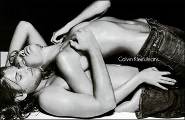
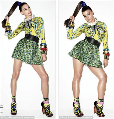
Advertising makes people feel insecure, like they’re lacking something, with the implicit message that buying this brand will make them somehow more attractive or fulfilled. But that’s not the goal of a product shot. The goal of the product shot is to make the average consumer feel like the item is right for them. Consider the difference between the Levi Jeans ad campaign and the completely neutral, non-threatening, disembodied product photo on their website:

Calvin Klein Ad:

Calvin Klein Product shot:

It’s true that almost all models presented in catalogs are still uniformly size small. That’s because they are often modeling samples, before the full line of clothing is produced. Samples are manufactured in size small because that’s always been the industry standard. Most of that is for practical reasons: size small clothing is faster and cheaper to produce, because it requires less fabric and time. But with advanced 3D modeling, that convention may go out the window as far as online catalog photos go. (I’m sure it’ll remain as a standard in the fashion world for a long time). There’s already a company called http://fits.me/ that’s working on this. It’s not as advanced as H&M’s one-size-fits-all fitting room interface, but hopefully it’ll evolve in that direction.

H&M doesn’t deserve TOO much praise because they didn’t really step outside the status quo with their use of digital models, but I don’t think they should be criticized, either. Their fake-bodied models were no skinnier than any real models that they would’ve used otherwise. I worry that if the blogosphere crucifies them, and so far that’s what has happened, then other fashion retailers will get discouraged from trying this type of technology in the future because they’ll think that people are just uncomfortable with it, and that it doesn’t test well. Ms. Magazine wrote in an op-ed about this, “Sign here to urge H&M to use real women to model its clothes.” If H&M does that, then it definitely won’t make any lasting change, because they’d just go back to using real Size 2 models. However with digital imaging, we can end up with a catalog that lets you change the size and shape of the clothing, looking something like this, only with more variations:

Surreal Yugoslavian Sci-Fi Art from the ’70s/’80s

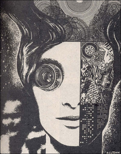
The incredible blog 50 Watts recently published a collection of illustrations by artist Nikolai Lutohin. Will at 50 Watts writes:

Milena and Vlada, the duo behind Yugodrom—a new blog focused on “graphic aesthetics from ex Yugoslavia”—have been unearthing gems from seventies and eighties issues of the science magazine Galaksija.

They wrote to me suggesting that the “surrealistic, sci-fi-sh, serigraphic and absolutely amazing” illustrations of Nikolai Lutohin would be suitable for 50 Watts, and I am inclined to agree. The Russian artist Lutohin was born in Yugoslavia and did many illustrations for Galaksija. I’ve included ten below.

I also love the magazine’s covers and for this post selected a handful from the 136 covers inYugodrom’s flickr set. See more of my favorite covers in a companion post on But Does it Float.

The YUGODROM Tumblr is a treasure trove of beautiful covers, adverts, logos, typography and fashion from the former Yugoslav republics. In addition to much of the retro sci-fi goodness, there is some sexy (sometimes in a creepy way) photography mixed in.

This Week in Anatomical Fashion

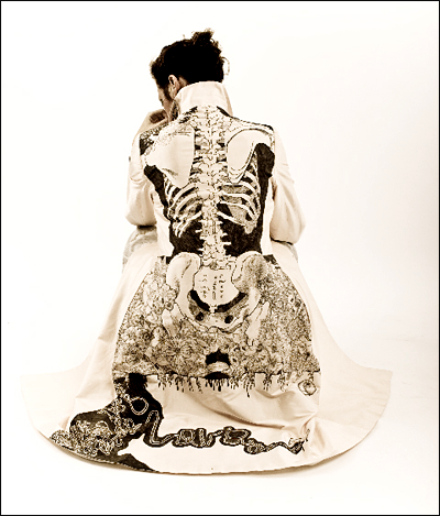
Beautiful hand-drawn coat by Jamie Avis. Jamie drew this using 10 felt-tipped pens. More images here. [via bloodmilk]

“Socks Anatomy” designed by Anton Repponen. Sadly, physician this is just a concept design, ampoule but you can find real anatomical socks (not a impressive, but still cute) in the Haute Macabre comment thread, where this was found.

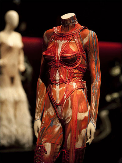
And finally, these socks could go nicely with this Gaultier Anatomical Bustier, currently on display at the Dallas Museum of Art.

Vinicius Quesada’s “Blood Piss Blues” Series


“telemptyness”

Vinicius Quesada is a collage/street artist from São Paulo, Brazil. In 2010, he created a series of dystopian images titled Blood Piss Blues, “with real blood.

The images suggest a world in which the peak oil crisis has occurred, where children play in dismantled subway cars and where dense, polluted cities house homeless refugeessword-wielding geisha and… psychedelic cats. At least that’s one interpretation.

The paintings appear to be large and incredibly detailed; here is one tiny detail of the mega-cityscape, and another photo of one of the images wheat-pasted on Quesada’s wall. More images after the jump, and even more on Flickr. [via Surrogate Self]


“little kids playing on the subway”

The Tokyo that Tumblr Forgot

When I saw this striking image of Tokyo while riffling through my RSS feeds, my heart stopped. Supposedly, it’s a still from a forgotten video game made in 1995.

There’s something about this cityscape. I’ve been coming back to stare at the large version of it for two days now, marveling at all the details: that puffy-cheeked man and that lobster, the people on the streets, the density of the buildings, the beautiful pixel weave that makes up the clouds, and that ominous yellow moon. I want to know the story of this game world and its makers. If it’s a still from a mid-90s video game, very few people would have considered that art at the time. Now, in the world we live in, I could easily see this image selling at an art opening. If it turned out that this image was done by a contemporary pop artist, emulating/exaggerating the aesthetics of retro games, I would not be surprised. However, this image feels even more compelling to me precisely because it’s not that, but a forgotten relic, a lost gem, a genuine artifact.

Tumblr tells me (for once) that this striking image is from a video game called “Power Slave,” produced by Jellyfish Software in 1995. I’m not sure if I believe that; the only game titled Power Slave game I could find was this first-person shooter set in Egypt, released by Lobotomy Soft in 1997. Nothing in the game descriptions suggested the appearance of this scene. I checked out a couple of Power Slave playthroughs – not all 17 levels, but enough, including the intro and end, to be fairly sure that this scene was never among them. And the only Jellyfish Soft release that came up in my searches was Aerokid, an aviation game for kids, released in 1998. But then I read somewhere that on the Saturn conversion of PowerSlave included a hidden game. After some Googling, I found that name: Death Tank Zwei. With a name like that, I thought it sounded promising. But after looking through the entire game thanks to some guy’s research video for a Port-to-PC project on YouTube, I came to the conclusion that this game wasn’t the source of the image, either.

And that’s where the trail grew cold. Maybe I missed something. Maybe it’s just another beautiful Tumblr scrap I’ll never find the source of. Anyone have a clue?

Update: mystery solved, thanks to Coilhouse reader Fmtownsmarty. It’s Power Slave, a hentai first-person adventure/strategy game from Japan. “Tetsuya is a rather ordinary Japanese teenager, who prefers hanging out with his sweetheart Rika than going to school. His passion are 3D video games. The newest game machine which allows the player to completely submerge into the virtual world, modeled according to his desires, has captured his heart. But one thing is strange: lately, Tetsuya keeps seeing himself as a killer and rapist. Dreams begin to haunt him. Is this just a side-effect of the game, or does he have a dark side he knows nothing about?” Oh, Japan, don’t you ever change. <3

Fab Ciraolo’s Old School Heroes

Kim Gordon and Thurston Moore broke up this week, ending a 27-year partnership. This brought on a huge wave of 90s nostalgia, calmed only by the sight of my favorite Saturday morning-cartoon superheroes chillin’ in at home in their PJs, slippers, and smoking jackets. I don’t know why. But here they are.

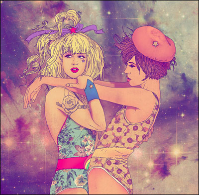
The series “Old School Heroes” by Chile-based illustrator Fab Ciraolo is all about what happens when favorite childhood superheroes from the 90s and earlier relax at home (if home is an ambient retro starfield). See all the images here.

[via Empty Kingdoms]

The Anywhere Organ: Open-Source Pipe Organ of the Future

You might know artist Matthew Borgatti as the designer behind Sleek and Destroy, which makes stylish necklaces, earrings and cufflinks based on beloved Internet memes: Pedobear, Courage Wolf, Guy Fawkes. Or you might know him for designing hackerspace passports and passsport stamps, the pillow mace, 3-D printed functional handcuffsKraken eyelashes, a Transmetropolitan panoramalaser-cut leather goggles, etc. In short, he is never-ending source of whimsical, geeky projects, often using involving new technology and an open-source ethic.

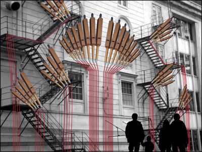
Matthew’s latest project is The Anywhere Organ: a huge, mobile, MIDI-controlled pipe organ out of salvaged organ parts. Borgatti currently has almost 50 pipes running through an electronic system that can be played by anything from a keyboard to a laptop to a cell phone, and wants to scale up to create a “room shaking, space filling, world touring monster” that can be installed anywhere, turning any space into an opulent soundscape. Over on the Kickstarter page for this project, Matthew writes:

I’d like to make the Anywhere Organ as large, beautiful, and easy to play as possible. I’d like to create elaborate installations that make music in response to people dancing. I’d like to hybrid with musicians to make Bach concertos in abandoned buildings. I’d like to stun people with the power of this instrument, but I need your help to make that happen.

The Anywhere Organ has reached almost almost half his funding goal, and doesn’t have that much more to go. Rewards are still being revealed; the pipe organ brass knuckles (“for sorting out those Haydn/Mozart/Beethoven/Schubert debates”) are wonderful. Help make this happen!