Genderfork: Exploring Androgyny, Bending Binary


Androgyny” by Rasha XO. (Via Genderfork.)

Earlier this summer, Warren Ellis (yes, that one guy we reference every ten minutes on COILHOUSE, shaddup) posted some cogent thoughts on what he describes as the end of “The Patchwork Years” on the internet: “Nobody needs another linkblog… There are already thousands of them. The job of curation is being taken care of. Look ahead.” He’s right. I’m as guilty of rehashing as the next blogger, but yeah. Generally speaking, we could do with far less circle-jerk turd-polishing online.

Paraphrasing the feisty theater renegade Maya Gurantz, those of us in any position to create new media should be baking new bread instead of quibbling over stale crumbs. At the very least, we existing curators should be doing helluva lot more cogitating instead of regurgitating the same tired old ones and zeros. (“Hey dood, check out this awesome link via BoingBoing via Fark via Digg via Shlomo McFluffernutter’s Livejournal feed. Cut, paste, click.”)

More on internet culture’s addiction to shorthand tastemaking at some later date.

Meanwhile, even in these postulated-out, post-patchwork years, it’s still very possible to be galvanized by some vital new curator. Fellow bay area sasspot Whitney Moses emailed me a while back about a blog called Genderfork, run by Sarah Dopp.


Shave by Madame Raro. (Via Genderfork.)

Genderfork is an exploration of androgyny and gender variance through artistic photography and personal essays. Dopp has two personal goals for the project:

To compile all of the genderforking resources, imagery, and ideas that I come across on the web into one beautiful repository. I want to experience a sense of cohesion with these concepts — they all too often feel scattered and disparate.
To encourage a conversation around the grey areas of gender with friends, with strangers, and with strangers who need to become friends.
…because I think we can all agree: Gender is a loaded word.

Loaded, and how. That’s why complex arguments revolving around gay marriage and partnership rights can become so volatile so quickly, and why debate rages endlessly on between gender-abolitionist feminists and their less radical sisters. It’s why surprisingly empathetic reportage on 20/20 examining the lives of transgender children feels like a huge victory, and why my co-editors and I fought tooth and nail to find a way to publish Siege’s Neogender piece in Coilhouse Issue 01, if only in a limited capacity.

Wayne Martin Belger’s Pinhole Paraphenalia

Wayne Martin Belger builds pinhole cameras – this much can be said with certainty. The rest becomes as rain-blurred and effervescent as the images his unique apparatuses produce. Pinhole cameras are still popular among hobbyists and are occasionally hailed as the purest photographic tool. With no lenses between the tool and the subject, the scene, the light and the depth of field are captured in smoky stills – as if snapped by the mind’s eye. Experiencing these images for the first time is more like viewing impressions, memories.

As you can see above, WMB’s cameras are beyond mere tools, more than means to an end. While many artists long for the process more than the product, Belger has redefined process-love completely. His projects sometimes plant their seeds through the items he collects, other times through ideas, upon the birth of which collecting begins. The camera he used to photograph AIDS victims is built with a vial of AIDS-infected blood, the one with which he captured the secret life of deer is crowned with antlers, expectant mothers were shot with a camera within which an infant’s heart sits still. He’s used bees, human skulls, religious relics, and more. Each device built by Belger contains its sacred object, each otherworldly photo series is just part of a ritual and carries with it the spirit of the camera, the concept, the execution itself.

Belger and his exquisite cameras can be seen next at Device Gallery on September 13, at a special reception from 6 to 9 pm.

Coilhouse Issue 01 is Ready For You!

Laibach in Coilhouse

Coilhouse Magazine, Issue 01 is finally here!

Get ready for 96 glossy, full-color pages of art, photography, music, fashion and literature. In this issue, the stark android beauty created by Andy Julia for our cover is counterbalanced inside by his elegant portfolio of vintage-style nudes. Our biggest feature in Issue 01 is an exclusive 10-page showcase and interview with the incredible taxidermy sculptress Jessica Joslin. Also in Issue 01, Coilhouse travels to Ljubljana, Slovenia (literally! we actually went!) to interview Laibach, while singer Jarboe tells war tales from her career post-Swans. Photographer Eugenio Recuenco contributes a lush 10-page portfolio and interview, while Clayton James Cubitt delivers a poignant, visceral spread (again, literally) on the topic of genital origami. Renowned science fiction author Samuel R. Delany shares an exclusive excerpt from his forthcoming novel, “From the Valley of the Nest of Spiders,” while our first installment of “All Yesterday’s Parties” digs up forgotten party photos from eras long gone, starting with London’s Slimelight circa ’95. Fans of WZW and Z!ST will love Zo’s fashion pictorial, in which she reconstructs a Galliano outfit on a budget. Pop-surrealist Travis Louie gives us a glimpse of his inner monster, and cult painter Saturno Butto has some medical fun at the expense of Catholics everywhere. All this, and much more – including supervillain how-to’s, Coilhouse paper dolls, interviews, fashion and art await. Get it now!

Eugenio Recuenco in Coilhouse

Readers of the blog, we have another treat just for you: the fact that the version of the magazine that you are buying here today will not be available in stores. Coilhouse will be in stores this fall, but it won’t be the unique version that’s available here. On this site, and on this site only, you can get the uncensored edition. This version includes a powerful piece that was too risqué for stores to accept without problems due to the graphic (and in our opinion, beautiful) images involved. Only 1000 copies of this very limited version exist – a mere fraction of the entire print run. And that version is only available here, on this site. When we run out, we’ll start selling the censored version that will also be available in stores – so get the limited edition copy that we call the “true version of the magazine” while we still have them!

  • $15.00 plus S/H
  • We ship internationally
  • We ship immediately
  • We accept credit cards and PayPal
  • You do not need to have a PayPal Account to use a credit card

Flickr Flurry: Launch Party Photos


Your hosts: Zo, Nadya & Mer by Andrew Yoon

That’s us up there, around 2am on Sunday morning, jaws stiff from smiling all night. We have you to thank, really – we couldn’t have expected a better turnout. An estimated 300+ people showed up throughout the evening. Familiar faces mixed with new ones, we welcomed several Issue 01 contributors and were delighted to finally meet some of you, as well.

Of course the night wasn’t without its challenges. Mer’s theremin got possessed during setup, Zoetica lost some skin executing parkour moves while jumping 12 feet from her roof onto a balcony during a lock jam emergency, Nadya’s hair interfered with the wireless connection, briefly. No matter, it was all ultimately worth it. The lemonade flowed electric, theremin music filled the air, the strawberries and meringues were sweet, the guests were plenty.

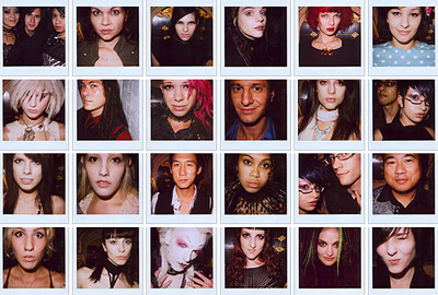
As promised, one of the chief attractions was our photo booth. Filled with Zo and Mer’s prized instruments, toys and inexplicable objects, it attracted a steady stream of thrill-seekers. Light-master Drew and soul-portraitist Lou, our esteemed photo-agents, put forth a herculean effort, the abundant results of which are on display on Flickr for your viewing pleasure.

A sampling of Lou’s gorgeous Polaroids:

    If your picture’s up here, feel free to identify yourself in the comments! Likewise, if you took or know of any other images from the evening, do share. Beyond the jump, just a few of our favorite portraits.

    Coilhouse Magazine Launch Party // Group Art Exhibit

    It is time! We’re happy to announce Coilhouse Magazine’s Launch Party and Art Exhibit.

    Held this Saturday at Hans Haveron Studios this event will be stuffed full of excellence. Look forward to:

    • Art, photography & fashion exhibit
    • Refreshments, with Mer’s “special” Electric Lemonade
    • Incredibly strange music
    • Photo booth with weird medical props, straight from Zo’s cave
    • Wall projections of Issue 01 art
    • Your first glimpse at the actual magazine!

    Enjoy art. Become art via expert lenses of Polaroid superstar Lou O’ Bedlam and Zo! Style Technician’s own Andrew Yoon. Dress your snazziest and bring your friends. Everyone’s invited!

    Venture below the jump to see work by the exhibiting artists.

    Typography from Typology: Bernd and Hilla Becher

    Photographer couple Bernd and Hilla Becher, cheap born in the 30s, dedicated their life to creating a visual taxonomy of the world’s industrial structures. Armed with a large-format camera, they traveled together for over 40 years to photograph and catalogue man-made constructions from every corner of the globe. Among their subjects were gas holders, blast furnaces, mineheads and water towers, whose monolithic portraits were arranged by the couple into “Typologies”; families of images that showcase the uniformity of these buildings, in context of each other, as they come together from all over the world. If you look at any of these images by itself, it’s meaningless – but if you look at them together, each picture’s power is multiplied by the ones around it.

    Seeing prints of these (or similar ones) at MOMA, my friend remarked to me, “these look like alphabets.” It’s true; as I looked at these I began to see a grid, stems, serifs, ligatures, bowls… slowly, letterforms began to emerge from the stoic architecture. Back in LA, I got to work: scanning, cutting and rearranging, I’ve been able to come up with several letters. Below are “C” and “U”. Would any designers/typographers out there be interested in collaborating on this? If so, drop me a line!

    On The Cover #1: Fresh Snow, Fresh Fruit, Fresh Meat

    If you can’t judge a magazine by its cover, it’s not doing its job. This month, major magazines work hard for the money:

    1. Rolling Stone released a very iconic Barack Obama cover. Just him and his flag pin. No name, no slogan and no eye contact. Pure faith and devotion. Compare to their last Obama cover, which made him look like a wax dummy of a superhero.
    2. Again Obama, this time as an illustrated character on the cover of The New Yorker, sporting his Al-Qaeda gear and giving his sidekick, Angela Davis Michelle, the fearsome terrorist fist jab. The best comment on the controversy surrounding this cover comes from Gawker: “this obvious and heavy-handed satire has enraged Democrats and liberal media critics because now they are pretty sure this nation of child-like imbeciles will believe it to be an un-retouched photograph from the FUTURE.”
    3. Predictably, this cover of Psychology Today caught my eye. Some nice use of type, but guess what? She’s wearing the corset backwards. How could something like be allowed to happen in 2008?

    See, we’ve been thinking about magazine covers a lot over the past few months. Deciding together as a group on the cover of Coilhouse Issue 1 was a very intensive process. That decision’s been made, but to help myself think about what makes for a good cover in the future, I’ve started compiling a personal list of favorite covers, which I now share with you. I’ve excluded the undisputed heavyweight champions (John Lennon and Yoko Ono, Andy Warhol in a Campbell’s Soup Can, etc.) from my list. It’s going to be a Top 9, with the first 3 being posted today as part of a series. Enjoy!

    9. Russia! Magazine, Winter 2008

    This cover of Russia! Magazine is sexy, sexy, sexy. It’s also a cheeky remix of a controversial banned photograph titled An Era of Mercy. Two of Russia’s top male models were employed for this shoot, with real spacesuits on loan from the Memorial Museum of Cosmonautics. The hip new Russian culture magazine also does a great job with its cover lines: Issue 2 has a bear dancing with Marilyn Monroe on the cover and entices you with the promise of “Eight More Bears Inside.”

    Celebrating Tesla’s Birthday, the David Bowie Way.


    Twink poses with The Haunted Corset, an Ebay find that terrified me so much I had to give it away.

    If Nikola Tesla were alive today and he went to The Edison, he’d be pissed. “Why’d they name it after that guy?” And since it’s his birthday today (thanks, John Colby, for the reminder), we’re going to rename this incredible venue The Tesla for the next 24 hours in his honor.

    So… looks like there’s some electric kissing party going on up in this joint! Happy Birthday, Nikola! The designer here is Mother of London, creating a sequel to the panoramic shoot that showcased an earlier collection – the first interactive, 360-degree fashion shoot ever created. Photographer Will Pearson came to LA from London to do this follow-up, and what you’re seeing here are preview stills – a taste of what’s to come, yet phenomenal images in their own right. When the panorama is complete, you’ll be able to navigate around The Tesla until your head spins.

    Allan Amato (aka Venus Wept) was the art director for the shoot. Models above are Ulorin, right, and Evan, left. Hairstyling by Linh Nguyen, NoogieStyle and Jamie Gatlin. Makeup by Daven Mayeda. You can see more images from this heart-stopping shoot on Allan’s blog. There were many more models involved, including some very cute boys.

    [More Images From This Shoot]

    P.S. – Over at CoilSpace.com, we were able to salvage everyone’s images, even if you didn’t email. There are probably twice as many as there were before. Enjoy, and thanks again!

    The Tarnished Beauties of Blackwell, Oklahoma

    Criss-crossing America’s interstates on shoestring music tours, my bandmates and I see scores of battered roadside billboards. They advertise ramshackle sculpture gardens, art brut outposts, World’s Biggest Fill-in-the-Blanks, rustic museums, and obscure historic landmarks. Such attractions are usually located in quiet little towns only a short distance from the highway. More often than not, we make a point to stop, stretch our legs and explore. These spontaneous jaunts expose us to beauty and knowledge we would never have discovered otherwise.

    Possibly the most delightful surprise on this last stint with Faun Fables was a visit to the Top of Oklahoma Museum, housed in the somewhat dilapidated (but still glorious) Electric Park Pavilion on Main Street in Blackwell, OK (population 7,700). A grand, white structure with a large central dome, the Pavilion was built in 1912 to celebrate the advent of electricity in Blackwell. Its design takes after styles exhibited at the famous “White City” of the World’s Fair in Chicago in 1893. Its lights, which originally numbered over 500, could once be seen for miles across the windswept prairie.

    toom.jpg

    These days, the Pavilion could use some serious TLC. Multiple leaks in the dome have endangered the museum’s contents. Plastic tarps enshroud several exhibits. Many items bear marks of water damage. One of the kindly septuagenarian docents who works there followed us from room to room, clucking over the holes in the roof, the rusty stains. These senior preservationists take a lot of pride in their charge, with good reason. The “TOOM” is a sprawling treasure trove of turn-of-the-century ephemera, railroad memorabilia, articles of Cherokee life, hand-carved walking sticks and pipes, dioramas, dollhouses, baby buggies, hobbyist’s taxidermy, antique musical and medical instruments, Victrolas, zinc smelting documentation, delicate handmade lace, linen and clothing, exceedingly creepy dolls, sewing machines, china, vintage propaganda, picture books, elaborate quilting, and countless other keepsakes left behind by the city’s first brave citizens.

    Judging by these artifacts, early non-native residents of Oklahoma were hardy, determined folk who struggled to eke out a life on America’s frontier. How they maintained such an unshakable air of dignity and refinement is beyond me, but Blackwell is a true, sparkling diamond in the rough. For me, nothing symbolizes the spirit of its citizens better than the following portrait, unceremoniously presented on a torn, water-stained bit of pasteboard in the museum’s “School Room”: ”

    lolasquires.jpg
    Who were you, Lola? Whatever became of you?

    The girl’s name was Lola Squires, and she was a student enrolled in Blackwell High, graduating class of 1916. That’s all I know. Her gaze knocked me back several feet. Once I finally stop staring at her, I realized that there were countless other flint-eyed and bow-bedecked young beauties on the walls nearby. I must have spent well over an hour in that one room, moving from portrait to portrait, documenting as much as I could, just stunned.

    “Starch Makes the Gentleman…” – Beau Brummell

    stefan01.jpg

    Deformed ribs, fainting rooms and OMGDRAMAZ – why should ladies have all the fun? Men wear corsets too! Male corsetry was first popularized in Regency England by Beau Brummell, the original dandy – a man who polished his boots with champagneHere he is in his pre-insane-from-syphilis days, sporting abs of whalebone. “Sixpack? Don’t need one.”

    There’s been a spectacular revival of dandy style in fashion magazines and on the runway, but it’s not until now that I’ve seen a strong new take with a darker tone. Photographer Peter Ashworth (previously mentioned here) recently collaborated with designer Stefán Orschel-Read (who also models in the shoot) to create Orschel-Read’s A/W fashion lookbook, “Mourning for Orlando” – a series that, at various turns, perfectly marries dandy and deathrock. My favorite images are of the streamlined corset/jacket combo; I imagine Mr. Pearl would approve! The collection includes a wider array of unusual pairings, including geisha, punk, Baroque, and, amazingly, the 70’s leisure suit. How do they all combine? See for yourself.

    stefan02.jpg