Vania Zouravliov Interview at Gestalten


‘Aaliyah’ / The Fader

Via Wurzeltod – Russian-born, London-based artist Vania Zouravliov has recently been interviewed at the Gestalten blog. Click here to read the interview. To my knowledge, this is Zouravliov’s first-ever interview on the web.


Fate

In the interview, Zouravliov discusses the symbolism in his artwork (the women usually represent him, while the men represent peril and fear), his working process (usually one drawing, start to finish, with no preliminary sketches), his parents (yep, they Made Him Weird), his inspirations (including artists as diverse as Sally Mann, Igor Bilibin and Franz van Bayros) and more. Zouravliov’s first book, Vania, comes out this fall.

Zouravliov currently doesn’t have his own website (his art site, unclevaniart.com, has been down for about a year), but you can still see a large collections at Big Active. Some of my favorite Zouravliov images, after the cut.

Also: in the same post that announces the Zouravliov interview, Wurzeltod also points to a new interview with our dear friend Madeline von Foerster at Beinart. Check it out!


Poe 4

For Furry Transgender Lolita, Press 8

By way of Boing Boing Gadgets, this phone is your “your one-stop shop for blackface, cosplay, fur and sex changes”:

Complete with a behind-the-scenes on YouTube.

Now, wouldn’t it be interesting if this ad were actually targeted towards the American audience, and engineered to spread virally through the tried-and-true “check out this weird Japanese shit” method? One ad, millions of hits, and not a single American TV spot booked. Smart, Sony Ericsson. Now we all think your phone is so futuristic. Where’s the model that turns me into a holographic vending machine?

On The Cover #1: Fresh Snow, Fresh Fruit, Fresh Meat

If you can’t judge a magazine by its cover, it’s not doing its job. This month, major magazines work hard for the money:

  1. Rolling Stone released a very iconic Barack Obama cover. Just him and his flag pin. No name, no slogan and no eye contact. Pure faith and devotion. Compare to their last Obama cover, which made him look like a wax dummy of a superhero.
  2. Again Obama, this time as an illustrated character on the cover of The New Yorker, sporting his Al-Qaeda gear and giving his sidekick, Angela Davis Michelle, the fearsome terrorist fist jab. The best comment on the controversy surrounding this cover comes from Gawker: “this obvious and heavy-handed satire has enraged Democrats and liberal media critics because now they are pretty sure this nation of child-like imbeciles will believe it to be an un-retouched photograph from the FUTURE.”
  3. Predictably, this cover of Psychology Today caught my eye. Some nice use of type, but guess what? She’s wearing the corset backwards. How could something like be allowed to happen in 2008?

See, we’ve been thinking about magazine covers a lot over the past few months. Deciding together as a group on the cover of Coilhouse Issue 1 was a very intensive process. That decision’s been made, but to help myself think about what makes for a good cover in the future, I’ve started compiling a personal list of favorite covers, which I now share with you. I’ve excluded the undisputed heavyweight champions (John Lennon and Yoko Ono, Andy Warhol in a Campbell’s Soup Can, etc.) from my list. It’s going to be a Top 9, with the first 3 being posted today as part of a series. Enjoy!

9. Russia! Magazine, Winter 2008

This cover of Russia! Magazine is sexy, sexy, sexy. It’s also a cheeky remix of a controversial banned photograph titled An Era of Mercy. Two of Russia’s top male models were employed for this shoot, with real spacesuits on loan from the Memorial Museum of Cosmonautics. The hip new Russian culture magazine also does a great job with its cover lines: Issue 2 has a bear dancing with Marilyn Monroe on the cover and entices you with the promise of “Eight More Bears Inside.”

Celebrating Tesla’s Birthday, the David Bowie Way.


Twink poses with The Haunted Corset, an Ebay find that terrified me so much I had to give it away.

If Nikola Tesla were alive today and he went to The Edison, he’d be pissed. “Why’d they name it after that guy?” And since it’s his birthday today (thanks, John Colby, for the reminder), we’re going to rename this incredible venue The Tesla for the next 24 hours in his honor.

So… looks like there’s some electric kissing party going on up in this joint! Happy Birthday, Nikola! The designer here is Mother of London, creating a sequel to the panoramic shoot that showcased an earlier collection – the first interactive, 360-degree fashion shoot ever created. Photographer Will Pearson came to LA from London to do this follow-up, and what you’re seeing here are preview stills – a taste of what’s to come, yet phenomenal images in their own right. When the panorama is complete, you’ll be able to navigate around The Tesla until your head spins.

Allan Amato (aka Venus Wept) was the art director for the shoot. Models above are Ulorin, right, and Evan, left. Hairstyling by Linh Nguyen, NoogieStyle and Jamie Gatlin. Makeup by Daven Mayeda. You can see more images from this heart-stopping shoot on Allan’s blog. There were many more models involved, including some very cute boys.

[More Images From This Shoot]

P.S. – Over at CoilSpace.com, we were able to salvage everyone’s images, even if you didn’t email. There are probably twice as many as there were before. Enjoy, and thanks again!

Nadya Rusheva: Sighs on Paper, Breathing Lines

nadyarusheva01.jpg
Left: Ballerina. Right: Apollo and Daphne.

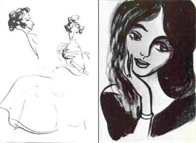
She died before I was ever born,  but she’s been with me all my life. Nadya Rusheva was only 17 when she succumbed to a brain hemorrhage in Moscow. She left behind ten thousand drawings – a fragile, incomplete catalogue of her teenage fascinations with Greek myths, Pushkin’s life, Bulgakov, Byron’s poems, War and Peace, and other bits and pieces from history and literature.
nadyarusheva02.jpg
L: Pushkin and Goncherova. R: The Transfiguration of Margarita

She once said that she lived the lives of the people she drew. Her drawings are simple, impulsive – some might even say they’re amateurish – but there’s something to them,  a spark, a keen insight, a visible love. For example, when she illustrated The Master and Margarita (which Zo and I blogged about), it turned out that her drawings of Margarita bore an eerie resemblance to Bulgakov’s wife – whom Rusheva had never met.

nadyarusheva03.jpg
L: Saying good-bye to Fox. R: Self-portrait.

She’s virtually unknown in the West –  not even a real Wikipedia page – but in Russia, she’s beloved by generations for her combination of tragedy, whimsy, youth and the adult-like insight that sometimes appeared in her work. Young fans still visit her museum and leave behind poems and drawings. On her Livejournal fan community, people swap scans of her drawings and write dedications. And a new film about her called “Secret Signs” recently came out in Russia.

Rusheva was born in 1952 in Mongolia to a Bolshoi theater designer and a ballerina (both of whom, I believe, are still alive today), and died in 1969. Some say that she was exploited to make the Soviet education system look good. I found two translations of the same document that claim that, upon being discovered, Rusheva was forced to produce artwork at a grueling pace so that the regime could hold her up as a paragon of Communist artistic training. One translation outright states that she was worked to death, but other (and better translation) doesn’t imply this. I’d never heard this before, even though I knew her work since childhood, thanks to my parents’ immense book collection. I could see it being true – despite the irony that Master and Margarita, one of her favorite books to illustrate, was banned when she drew it.

After the jump, my favorite Rusheva drawings (there’s lots!) and more.

Who is on the Other Side?

whoareyouguys.jpg

A while back, Zo posted about an indie film that’s being made in Finland. One Jani from Tampere abruptly appeared in the comments to say “hey, the production team comes from my city!” It made me wonder: who’s out there? Every day, I get at least one new registration to the site. Some of the emails are shady ([email protected]? uh, no), but most look real – some give me a good laugh. But, out of all who register to post comments, a relatively small percentage ever speaks their piece.

I’ll be embarrassed if no one replies, but here goes: who’s reading? I’m especially curious to hear from the lurkers, but from everyone who comments as well.  I want to know all you guys better. Perhaps I know some things about you already, like your taste in men (pervs!) and what made you weird. So, really, I’m more curious about the basics:

  • who you are
  • where you’re from
  • what you do in life
  • maybe even what you look like?

Warren Ellis does this self-portrait thread, and I love that idea. I’m sure some of you are from over there (hey, Shay!).

So… introduce yourselves! Tell all! No nudes.

UPDATE: CH guest blogger David Forbes has come up with this nifty map to create a visual summation of the response to this post. Forbes writes, “this map is the product of insomnia, writer’s block and appreciation. It will be updated as more info comes in. It isn’t horrendously accurate past the “Oh, that big red dot is Manchester” level, but it serves to show the array of worldwide (some on every continent) readers that Coilhouse has. So Los Angelines, St. Franciscans, Oaklandroids, Yankees, Kiwis, Aussies, Southerners (North Carolina!), Portlandracks, Chicagoans, Canucks, Irishers, England-types and everyone else: the signal is “Abraxas.” When you hear this word transmitted via morse code, rise up and take over!

Fashion in 2008: Good So Far, Still Needs More Lace

lacroix01.jpg

It’s nice to see that “weird shit” is back in style. Above, the latest from last week’s Christian Lacroix haute couture show in Paris (via parlour). Although there were no uniformly mind-blowing collections, there are a few choice pieces here and there, including this 20s-meets-the-future ensemble by Galliano (and from that same collection, these evil-looking shoes!), as well as this sexy number from Chanel. In truth, it’s nothing we haven’t seen before, but that doesn’t make it any less pleasant to behold.

However, the one designer who’s truly been kicking ass this year is handsome devil Gareth Pugh (previously here). What I love most about his Autumn/Winter 2008 collection is the texture. I bet wearing his stuff feels like being a piece of origami. And I have a feeling he’s only getting started. Go, Garteth, go!

pugh01.jpg

Daily Drag Queen Affirmations: 365 Days of Faboo!

Daily Drag Queen Affirmations (DDQA) offers 365 videos of different drag queens who each offer you a fresh, life-affirming nugget of wisdom for every glorious new day – all for just 20 bucks. “Buy it for yourself. Buy it for a friend. Buy it for that bitch you know!” They offer some samples on their YouTube channel, including my favorite one, above.

The all-star cast of this endeavor includes Willam Belli, the mastermind and star of Tranny McGuyver, a show that Belli describes in the following terms: “Basically, it’s In the Heat of the Night meets Tootsie without all the heart-of-gold, positivity bullshit. We’re not trying to out-dyke Cagney & Lacey or anything. Just watch it. It’s fierce.” No, really. Just watch it!

“You want the beef taco or the fish taco?” Priceless.

Daily Drag Queen Affirmations, via bluefirecracker

“Starch Makes the Gentleman…” – Beau Brummell

stefan01.jpg

Deformed ribs, fainting rooms and OMGDRAMAZ – why should ladies have all the fun? Men wear corsets too! Male corsetry was first popularized in Regency England by Beau Brummell, the original dandy – a man who polished his boots with champagneHere he is in his pre-insane-from-syphilis days, sporting abs of whalebone. “Sixpack? Don’t need one.”

There’s been a spectacular revival of dandy style in fashion magazines and on the runway, but it’s not until now that I’ve seen a strong new take with a darker tone. Photographer Peter Ashworth (previously mentioned here) recently collaborated with designer Stefán Orschel-Read (who also models in the shoot) to create Orschel-Read’s A/W fashion lookbook, “Mourning for Orlando” – a series that, at various turns, perfectly marries dandy and deathrock. My favorite images are of the streamlined corset/jacket combo; I imagine Mr. Pearl would approve! The collection includes a wider array of unusual pairings, including geisha, punk, Baroque, and, amazingly, the 70’s leisure suit. How do they all combine? See for yourself.

stefan02.jpg

Daily Mail Posts Striking Images, Condescending Text

africa01.jpg

Yesterday, Sociological Images reposted these incredible images, which originally came from the Daily Mail, a conservative British tabloid. These images appeared in “Femail” – the Daily Mail’s lifestyle section for women – under the title “Out of Africa: The incredible tribal fashion show inspired by Mother Nature.” Both SocImages and another fascinating blog, zunguzungu, took issue with the vapid exoticization that was going on in the article. I highly reccomend reading zunguzungu’s eloquent analysis of the Daily Mail’s presentation of these images, titled “Recycling Africa“.

Serious Business aside, I just want to say this: the images themselves are absolutely striking. When I separate these images from the Daily Mail’s silly writeup (“As they paint each other’s bodies and make bold decisions about their outfits… it seems that the only thing that motivates them is the sheer fun of creating their looks, and showing them off to other members of the tribe”), and from SocImages’ somewhat guilt-tripping Daily Mail smackdown (“What does it mean that people in the U.K. (and the U.S.) are consuming these images? What is the relationship between these images and colonialism? How do such images interact with “development” rhetoric about how Africa is un- or under-developed, developing, or undevelopable?”), on a purely visual level, I’m just absolutely inspired.

It’s amazing, how we can rearrange ourselves.

africa02.jpg